Overview
COOP Careers (backed by Google) is a nonprofit fellowship that helps first-generation and low-income college graduates break into professional careers through a 16-week, cohort-based program in Digital Marketing, Data Analytics, and Financial Services. I went through the program myself in 2017 in San Francisco, at the very start of my career. COOP gave me the skills to land my first role as a Paid Search Analyst, learning resources I couldn't have afforded otherwise, and a community of peers to grow with.
In 2020, I transitioned into product design. And the further I got into my design career, the more I thought about what COOP's learning experience could look like if it were intentionally designed, not just as a program, but as a product.
This project is my attempt to pay that forward. I set out to design a centralized learning platform for COOP fellows, alumni, and Captains: one place to access curriculum, resources, and community during the fellowship and long after it ends.
Visit their website at www.COOPcareers.org
The Problem
The learning experience is scattered across too many tools, making it hard for fellows to stay on track.
COOP's learning experience is spread across three separate tools with no central home. Students track their progress and submit assignments in Google Classroom, receive class and event updates through Gmail, and check announcements in Slack. Nothing connects these touchpoints, so staying on top of the program requires constantly switching between platforms and hoping nothing falls through the cracks.
The result: there's no single place for a fellow to see where they stand, what's coming up, or what they might have missed.
The Solution
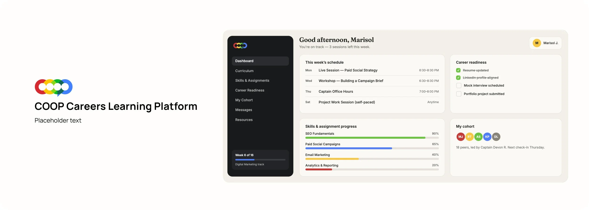
I designed a student portal that brings COOP's fragmented experience into one place. Fellows can track their progress, submit assignments, view announcements, browse upcoming events, and access a shared COOP calendar — without ever leaving the platform.
Research and Discovery
To make sure the design was grounded in real behavior rather than assumptions, I started by drafting a research plan. The plan outlined a series of semi-structured interviews with three groups: current fellows, alumni, and Captains. Each group surfaces a different layer of the experience. Fellows reveal what it's like to navigate the program in real time, alumni show what sticks and what gets abandoned after graduation, and Captains expose the content delivery side that fellows never see.
USER SURVEYS
I wanted to gain a better grasp of what struggles current COOP students faced with the program, so I crafted together a survey to send out to 20 students. Some of the questions I wanted to answer were:
What areas of the COOP Careers program can use improvement in to make the overall experience less tedious?
What data and features would a student find useful in a dashboard?
What type of KPI would a student find valuable to track for themselves?
Beyond interviews, I also audited COOP's existing content touchpoints to map where information currently lives and how discoverable it actually is. And to get as close to the real experience as possible, I sat in on student sessions in person, going through the program alongside fellows rather than just asking them about it after the fact.
Three themes surfaced across interviews:
1
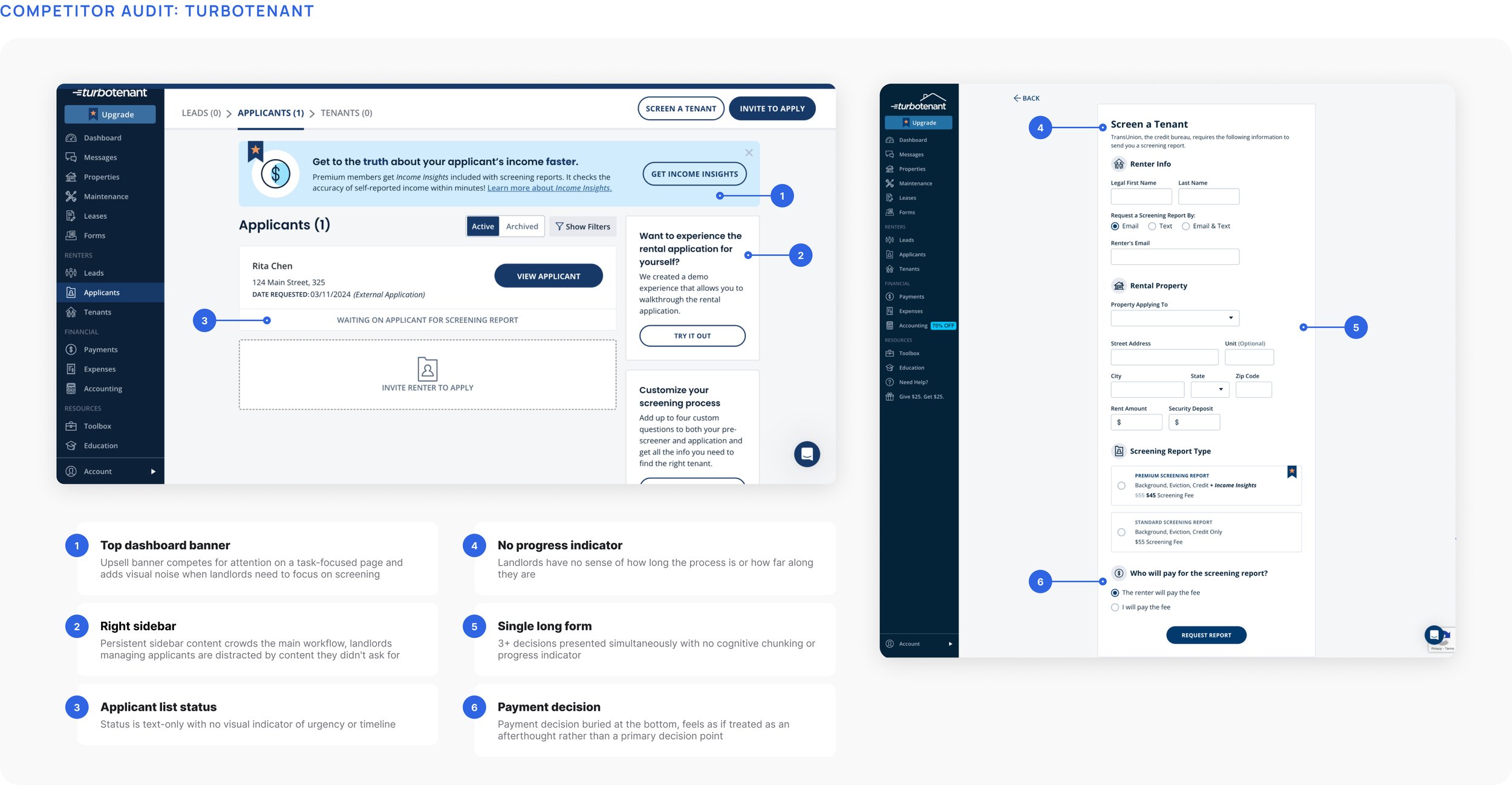
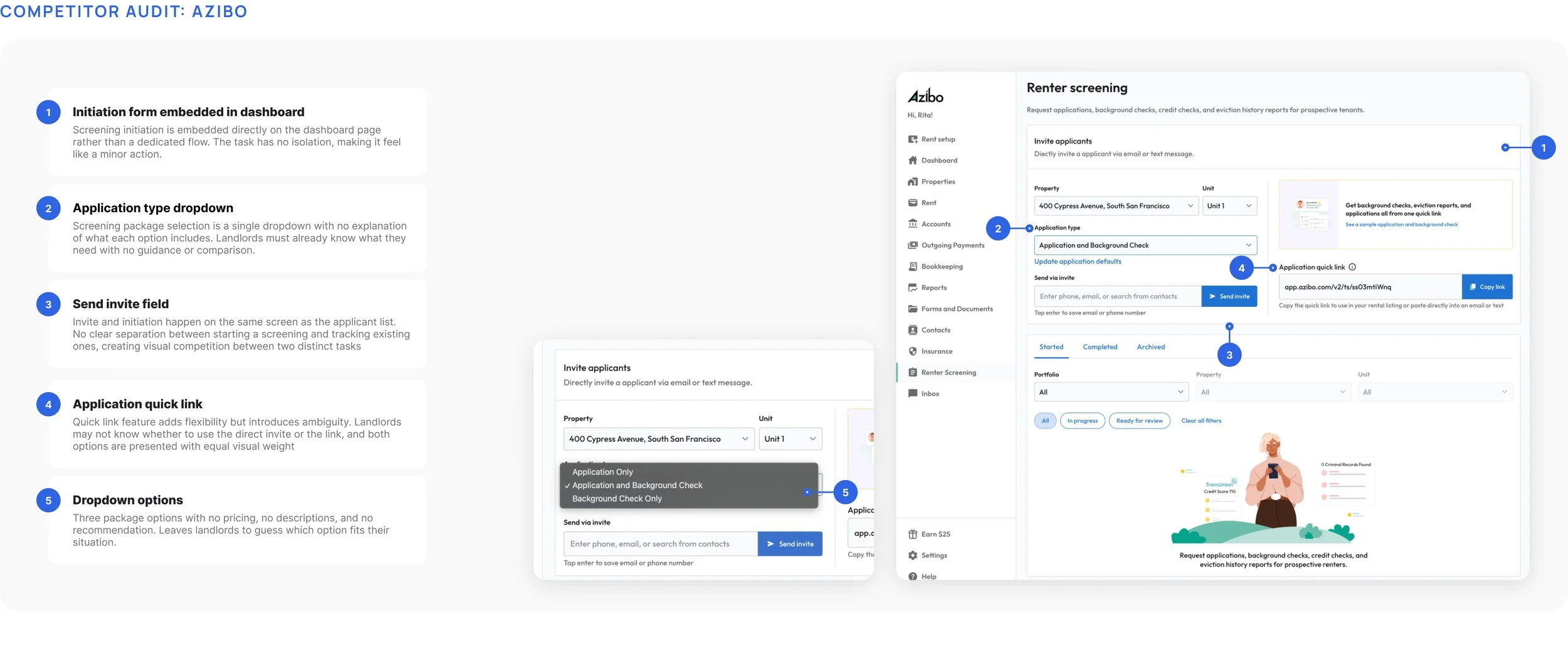
Screening takes too long
Landlords who had more than 5 properties described the process as drawn out and hard to manage alongside a full-time job or multiple properties.
2
The process is fragmented
Landlords were jumping between tabs, spreadsheets, and emails just to review one applicant.
3
Conversion matters on both sides
If an applicant abandons the flow halfway through, the landlord has to start over. Friction on either side has a cost.
Design Principles
The insights from the research pointed to a clear opportunity: a unified, guided screening experience that worked for both sides without adding complexity to either.
01
Modern and Trustworthy
Screening is high-stakes — landlords enter payment info and make legal decisions. The visual language had to feel credible and trustworthy.
02
Distinct, focused steps
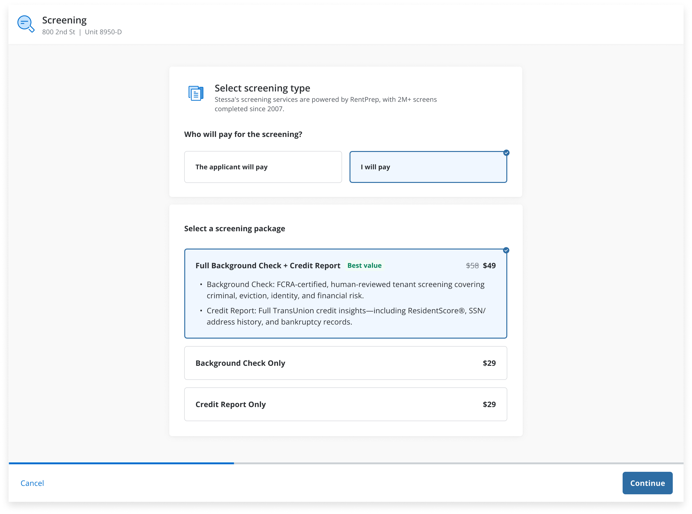
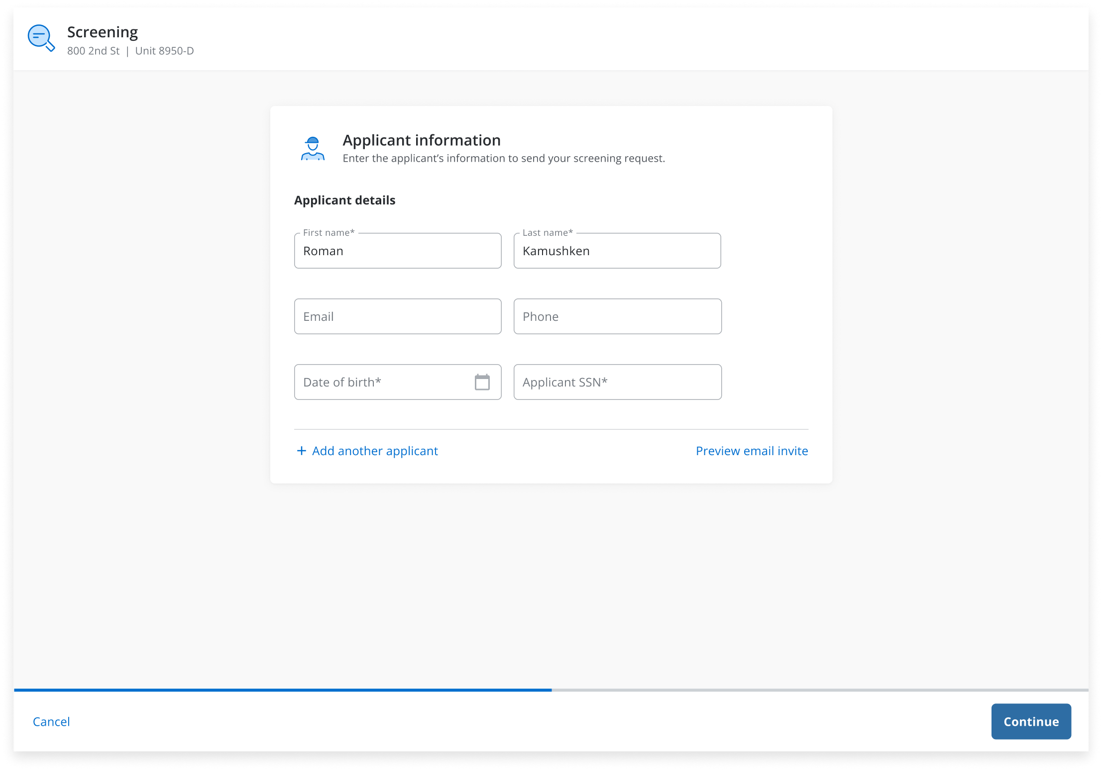
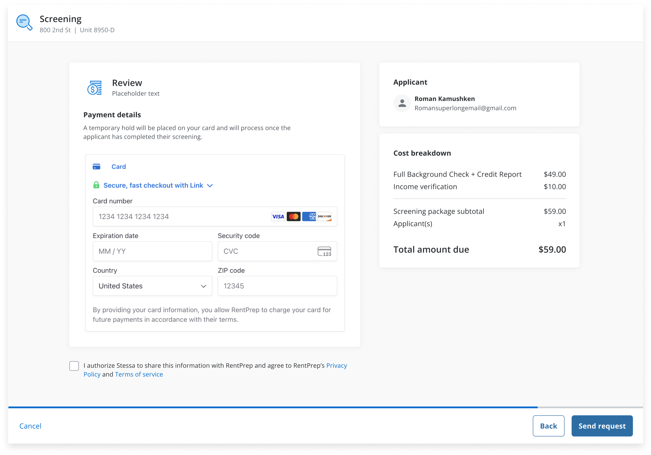
With multiple decisions to make: package selection, applicant details, and payment, I broke the flow into focused steps so each screen had a single job.
03
Low friction on both ends
If either side hits a wall, the whole process stalls. The design had to be simple and clear for the landlord who’s busy, and applicant who’s impatient.
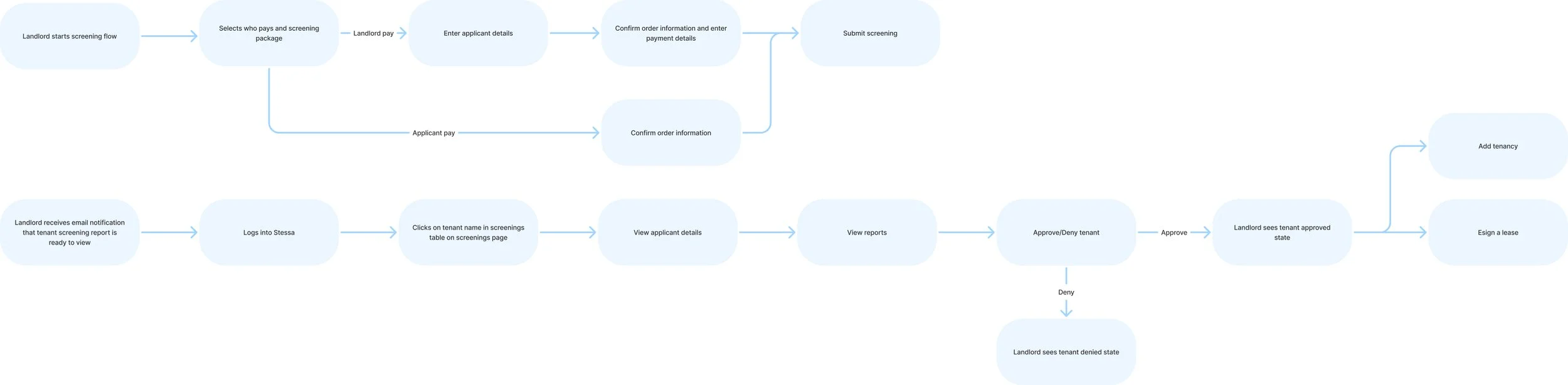
Before designing individual screens, I mapped the end-to-end experience user flow for both the landlord and applicant paths. This helped me identify the key branching points early and ensure the experience held together end-to-end before getting into details.
Final Designs
Select Screening Package and Submit Request:
A key branching point shaped the entire flow structure: landlords who chose to pay upfront needed to provide payment details before sending the request, while those who passed the cost to the applicant skipped payment entirely. This conditional logic made a single-page form unworkable,while a multi-step flow let us gate the payment screen behind the payment decision, so each landlord only saw what was relevant to their path.
Screening main page:
For the dashboard, I opted for a clean table layout showing all applicants alongside their screening and application statuses. I had explored a card view iteration first, but as we stress tested it with real data, the density worked against us. Landlords managing multiple applicants needed to scan quickly, and cards fragmented that scan. The table layout let us surface all the critical statuses at a glance without sacrificing clarity as the list scaled.
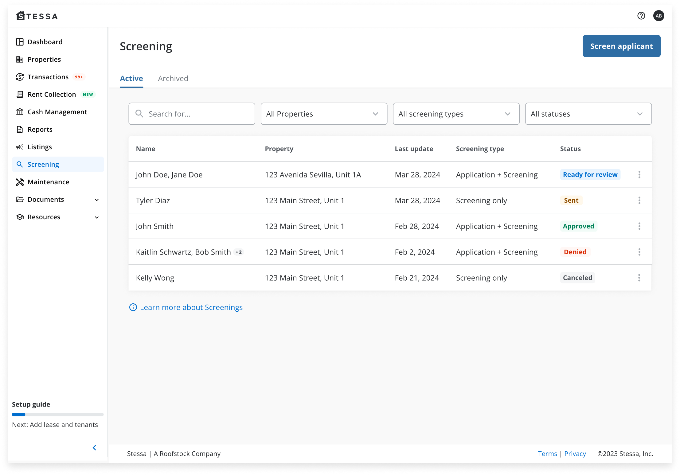
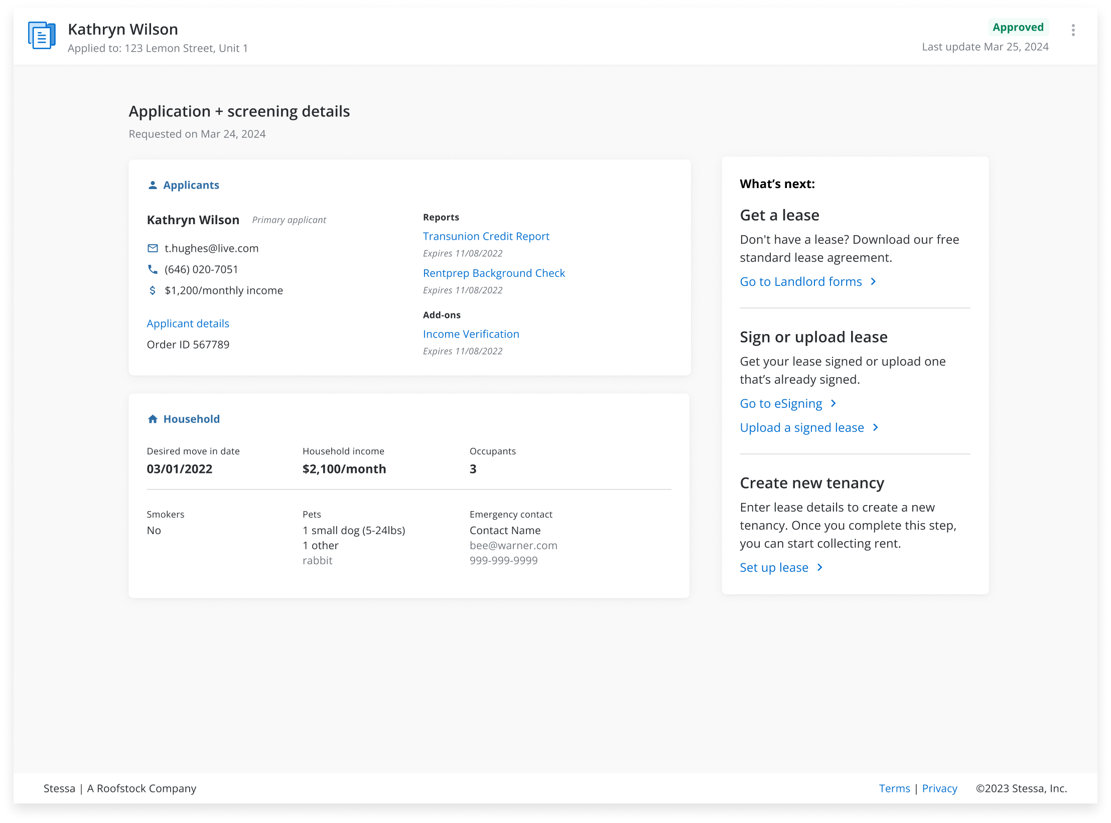
The applicant details page was adapted from an existing rental applications screen designed by another team. I refreshed the visual design to align with the screening context while maintaining consistency with the broader Stessa product.
Outcome
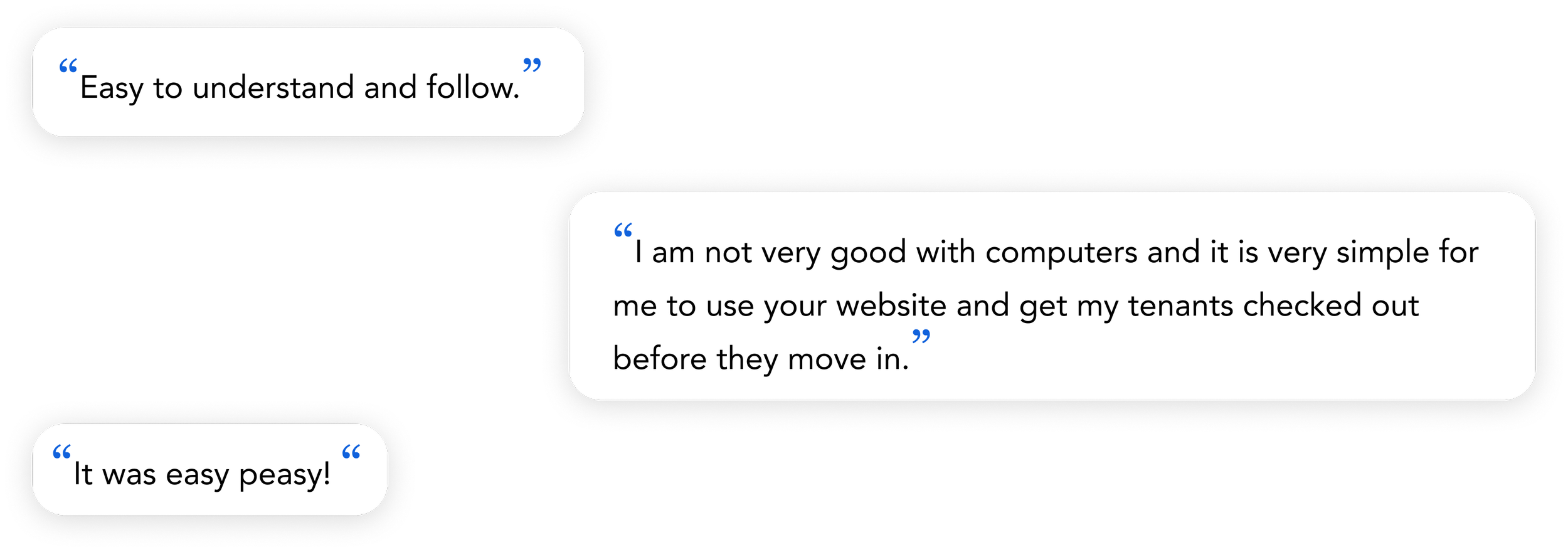
Landlords no longer had to piece together information from separate tools, and the feedback we got back reflected that, and people found the results view easy to read and the initiation flow much more manageable than what they'd used before.
$4M annual revenue: the native integration turned a third-party acquisition into a revenue-generating product line, establishing screening as a meaningful part of Stessa's business
85-95 NPS score: Landlords cited the clarity of the results view and the simplified initiation flow as meaningful improvements over previous workflows
Faster screening turnaround: Consolidating the workflow into Stessa reduced the time landlords spent managing screening across multiple tools.
Shipped end-to-end:The feature launched with full coverage across the initiation, applicant-facing, and results flows.
Reflection
This project taught me a lot about designing under real constraints. Without access to user interviews or funnel data at the time of the acquisition, I leaned heavily on competitive research and product intuition, which got us to a solid v1.
If I were to revisit this today, I'd push the dashboard from a status overview to something more directive. A landlord managing multiple properties and applicants simultaneously doesn't need a page that just informs them - they need one that guides them.
This is where AI could do meaningful work. Rather than showing all applicants in a flat list, the dashboard could use AI to intelligently surface what needs attention most urgently: a screening that's been pending for 48 hours, an applicant whose report just came back, a payment that's about to process. The key design challenge would be building landlord trust in those prioritizations: showing enough reasoning behind why something is flagged as urgent so the landlord feels in control, not overridden.