Overview
When Stessa (a Roofstock company) acquired RentPrep, a tenant screening service, it created a strategic opportunity to expand beyond accounting and portfolio tracking — becoming the one tool landlords need to find, screen, and onboard great tenants.
My role was to lead the design of the end-to-end screening experience: embedding RentPrep's services natively into Stessa while making the flow feel simple, trustworthy, and fast for independent landlords.
Impact: The native integration turned a third-party acquisition into a revenue generating product line, contributing $4M annual revenue. The feature launched to an 85–95 NPS score, with landlords citing the clarity of the results view and the simplified initiation flow as meaningful improvements over their previous workflows.

Independent landlords face two persistent problems when screening rental applicants:
Fragmentation: Credit checks, background checks, and income verification lived in separate tools. Landlords had to manage multiple logins, reconcile separate reports, and make decisions without a unified view of an applicant.
Time pressure: Every day a unit sits between applicants costs money. A slow or confusing screening flow delays decisions, and in competitive rental markets, hesitation can mean losing a qualified tenant to another landlord.
When Stessa acquired RentPrep, it created an opportunity to solve that problem natively. But without a unified experience, the acquisition would deliver the service without changing the behavior. Landlords would still leave Stessa to use RentPrep, and the platform would lose the retention and revenue opportunity the acquisition was meant to create.

Rather than a deep link or iframe (the path of least resistance), I pushed for full native integration. The solution was a two-sided screening experience built entirely inside Stessa, covering the landlord-facing initiation flow and the applicant-facing portal, so neither user ever felt like they were leaving the product.
Research and Discovery
The acquisition timeline didn't leave room for direct user interviews with landlords or funnel analytics. Rather than treating that as a blocker, I designed an alternative discovery approach.
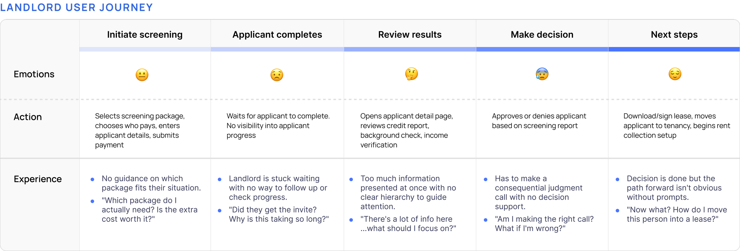
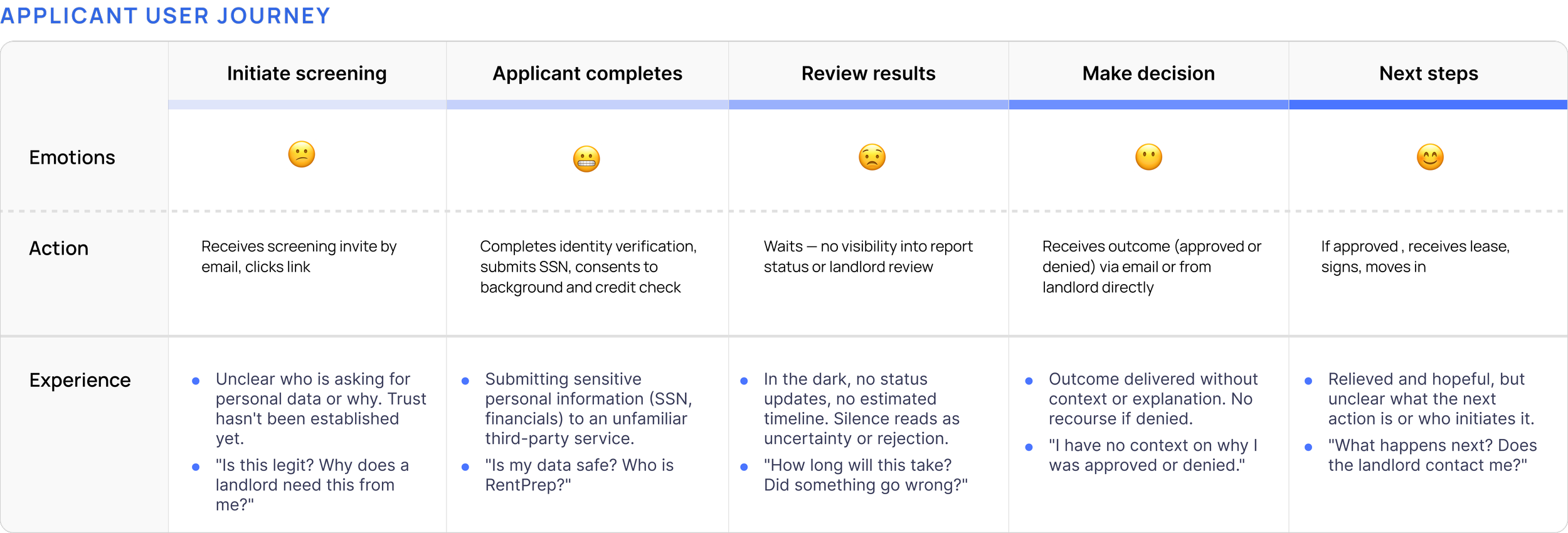
Because this was a two-sided flow, I mapped both the landlord and applicant journeys before touching a single screen, capturing actions, thoughts, and emotional state to identify where friction was highest.
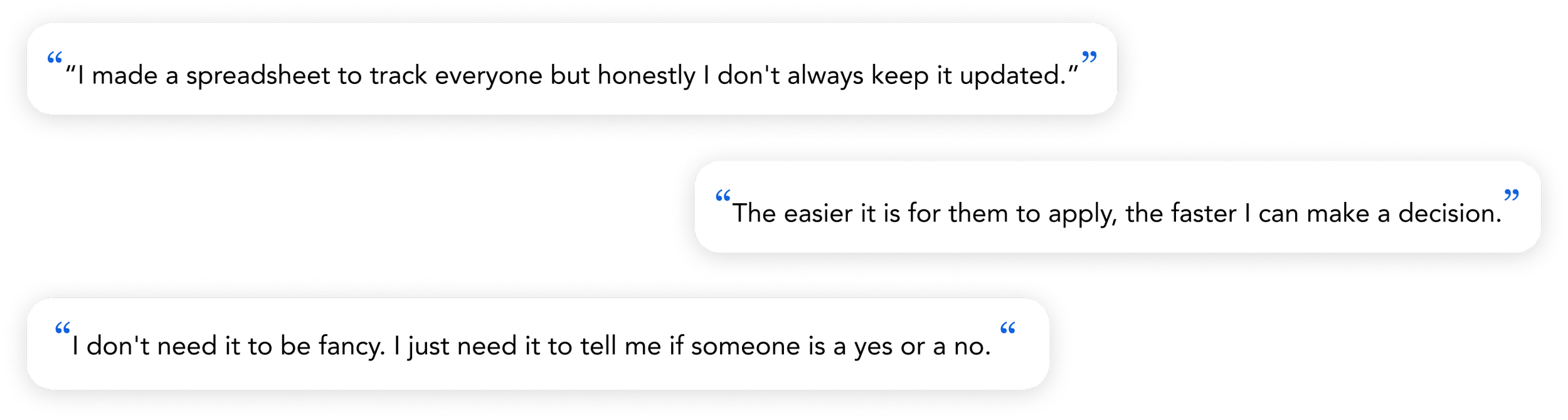
With limited time and no formal recruiting pipeline, we had to be scrappy. I ran informal interviews with Stessa employees who happened to be landlords. I used their firsthand experience to pressure-test my assumptions about how screening decisions were actually made in practice.
Three themes surfaced across interviews:
01
Screening takes too long
Landlords who had more than 5 properties described the process as drawn out and hard to manage alongside a full-time job or multiple properties.
02
The process is fragmented
Landlords were jumping between tabs, spreadsheets, and emails just to review one applicant.
03
Conversion matters on both sides
If an applicant abandons the flow halfway through, the landlord has to start over. Friction on either side has a cost.
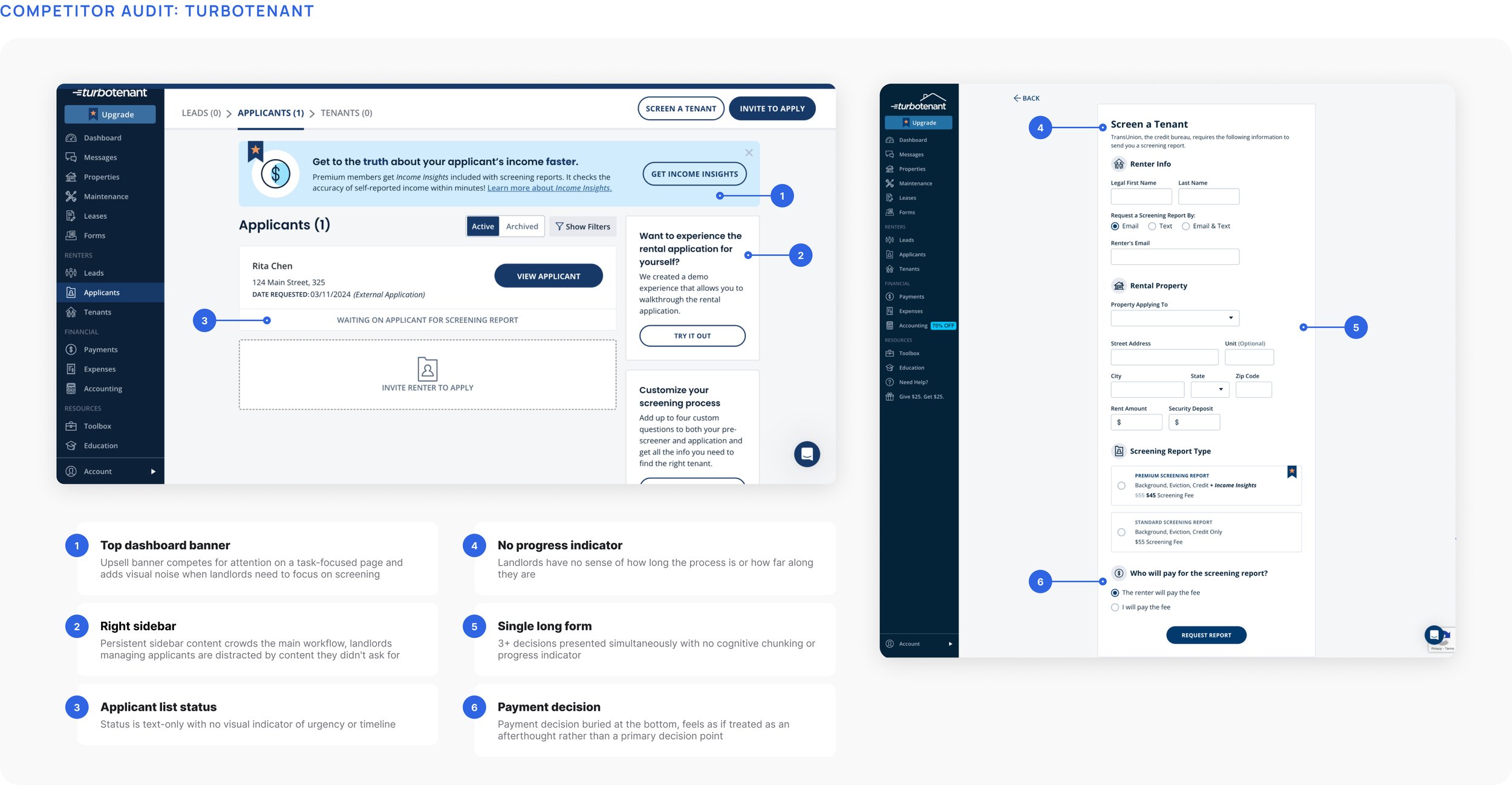
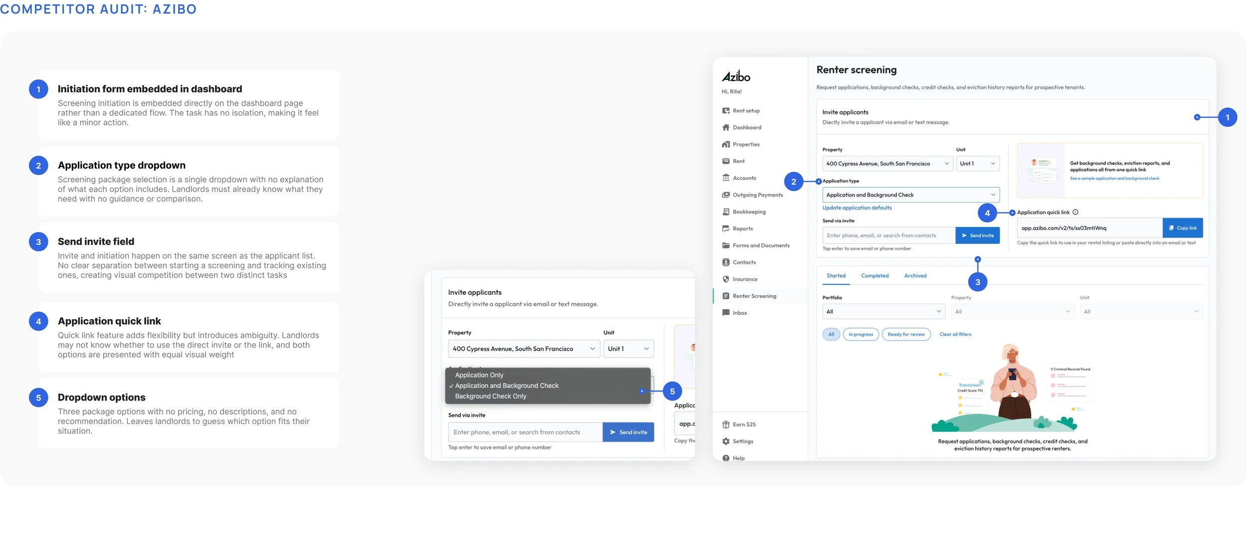
I conducted a heuristic analysis of the screening flows of TurboTenant, Azibo, and RentPrep's original design to identify failure modes and establish a clear design direction grounded in what competitors were getting wrong.
Design Principles
The insights from the research pointed to a clear opportunity: a unified, guided screening experience that worked for both sides without adding complexity to either.
01
Modern and Trustworthy
Screening is high-stakes — landlords enter payment info and make legal decisions. The visual language had to feel credible and trustworthy.
02
Distinct, focused steps
With multiple decisions to make: package selection, applicant details, and payment, I broke the flow into focused steps so each screen had a single job.
03
Low friction on both ends
If either side hits a wall, the whole process stalls. The design had to be simple and clear for the landlord who’s busy, and applicant who’s impatient.
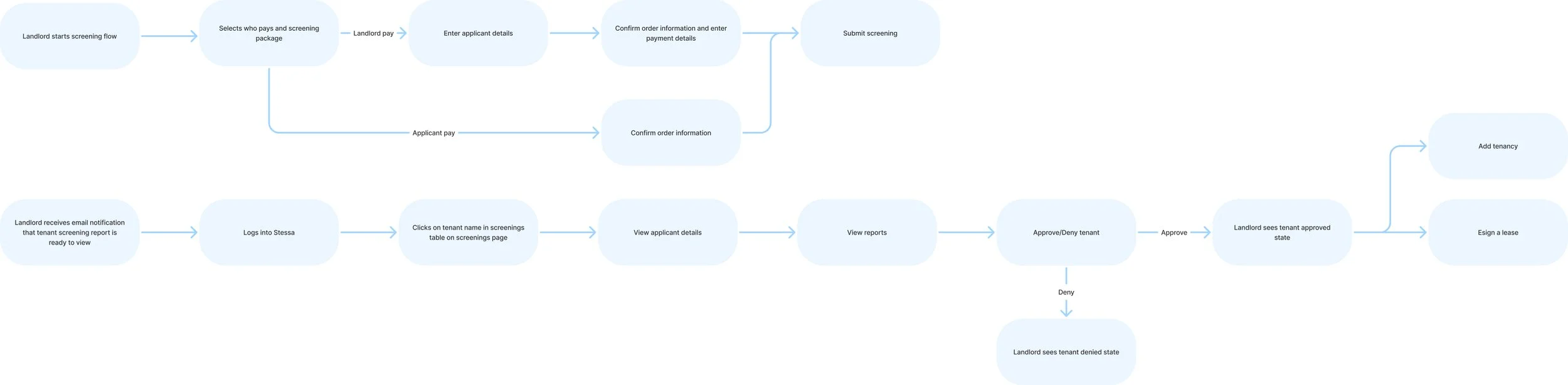
Before designing individual screens, I mapped the end-to-end experience user flow for both the landlord and applicant paths. This helped me identify the key branching points early and ensure the experience held together end-to-end before getting into details.
Final Designs
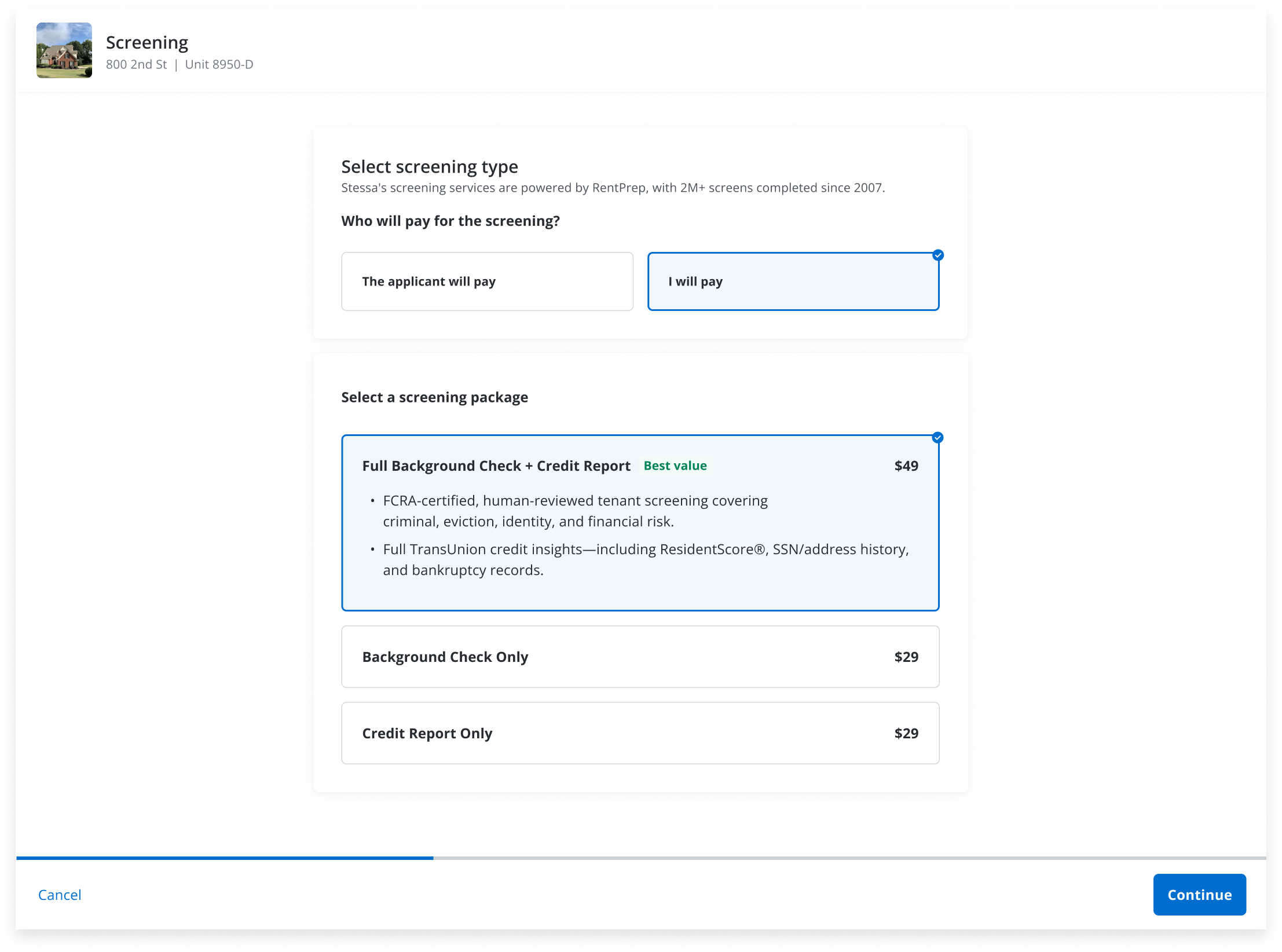
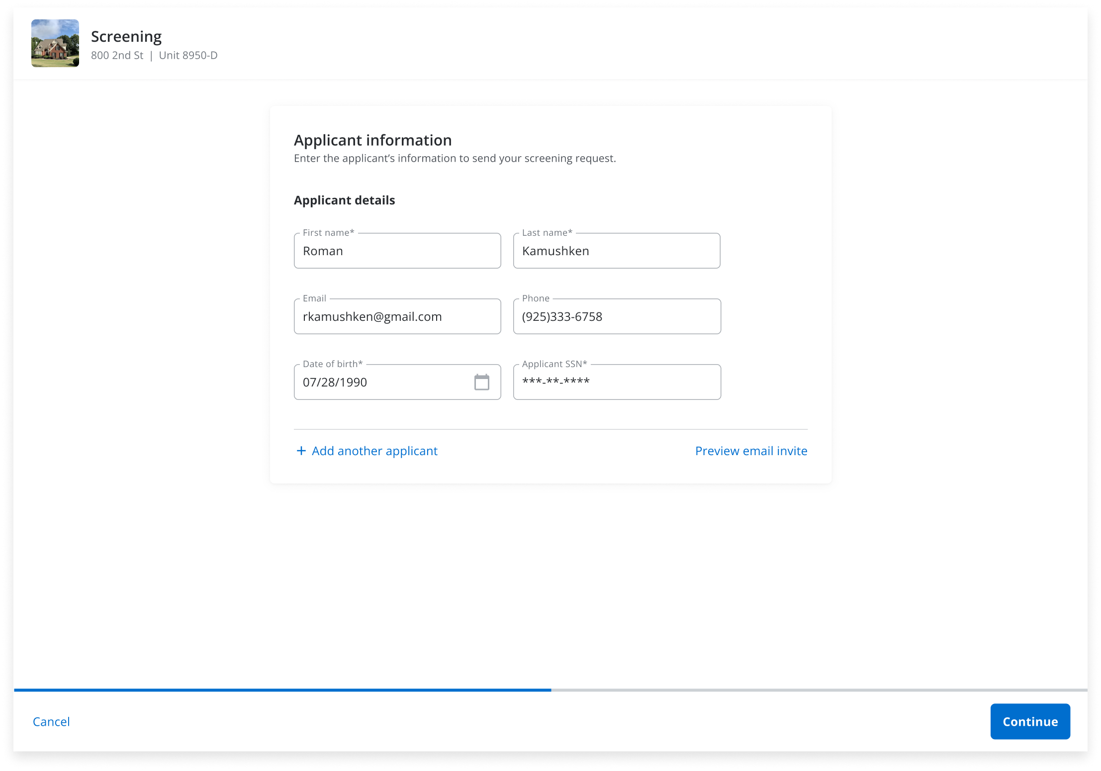
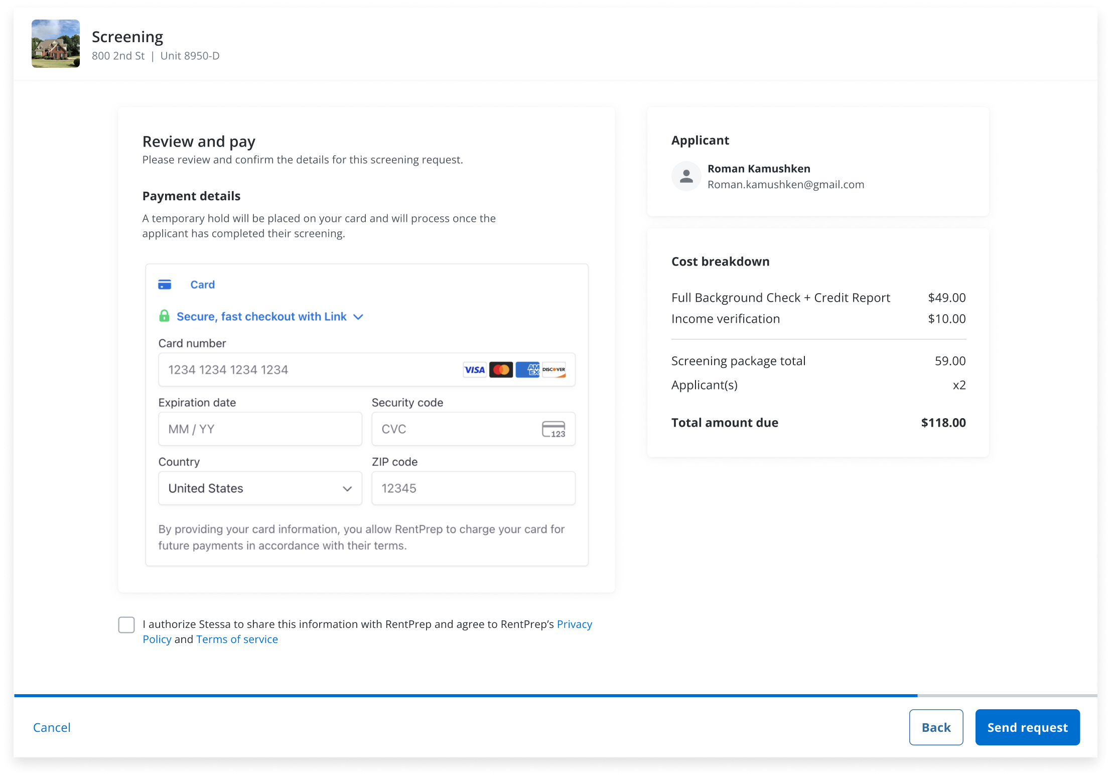
Select Screening Package and Submit Request:
A key branching point shaped the entire flow structure: landlords who chose to pay upfront needed to provide payment details before sending the request, while those who passed the cost to the applicant skipped payment entirely. This conditional logic made a single-page form unworkable,while a multi-step flow let us gate the payment screen behind the payment decision, so each landlord only saw what was relevant to their path.
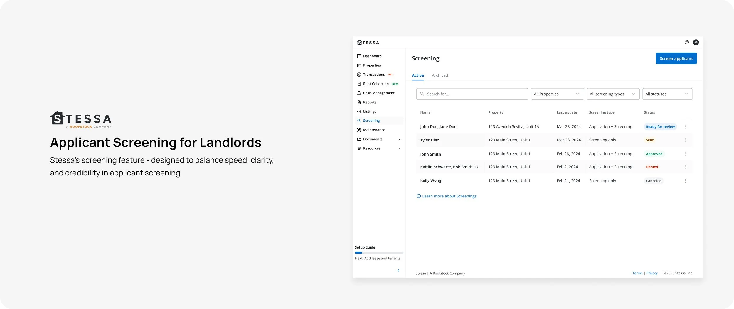
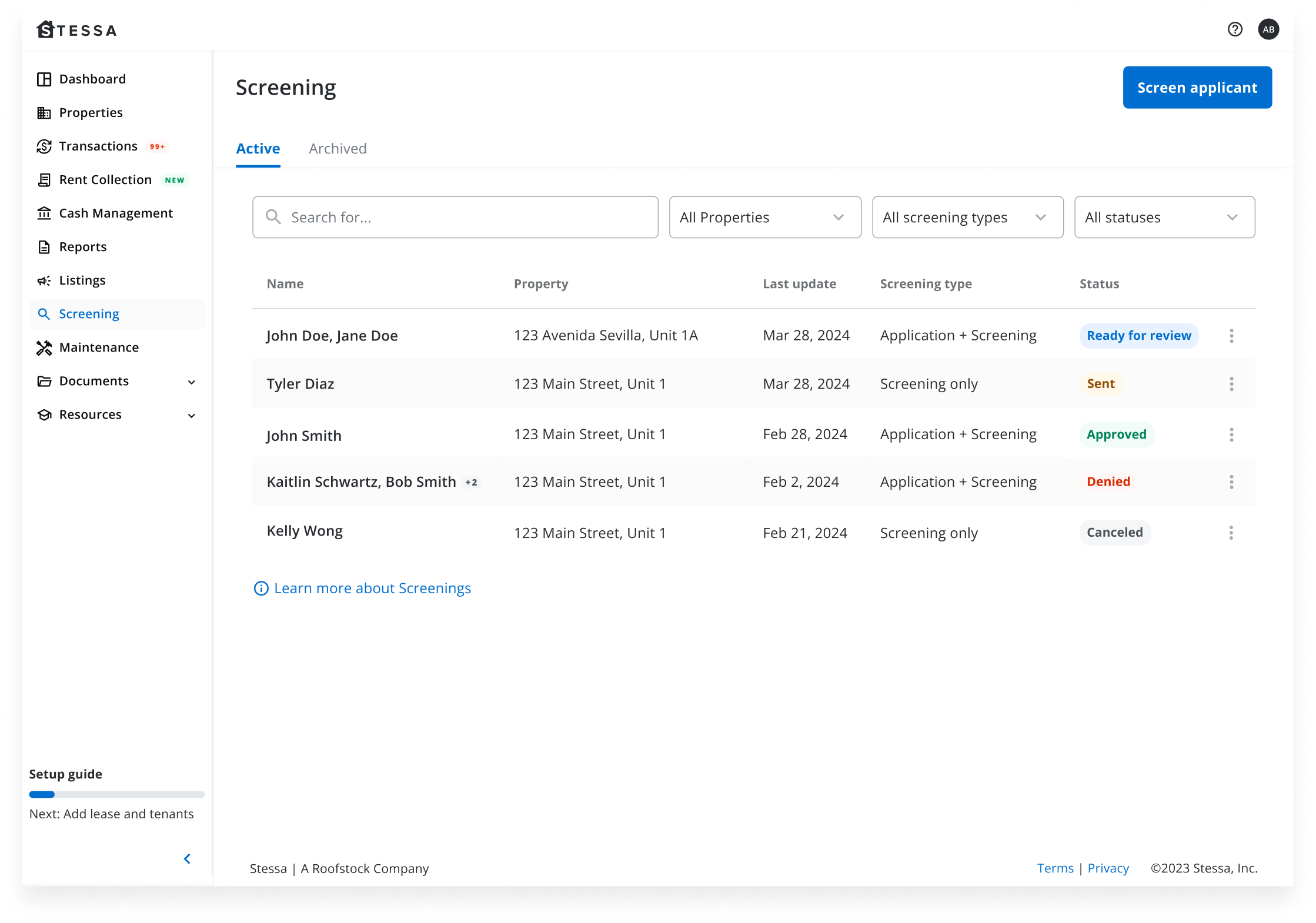
Screening main page:
For the dashboard, I opted for a clean table layout showing all applicants alongside their screening and application statuses. I had explored a card view iteration first, but as we stress tested it with real data, the density worked against us. Landlords managing multiple applicants needed to scan quickly, and cards fragmented that scan. The table layout let us surface all the critical statuses at a glance without sacrificing clarity as the list scaled.
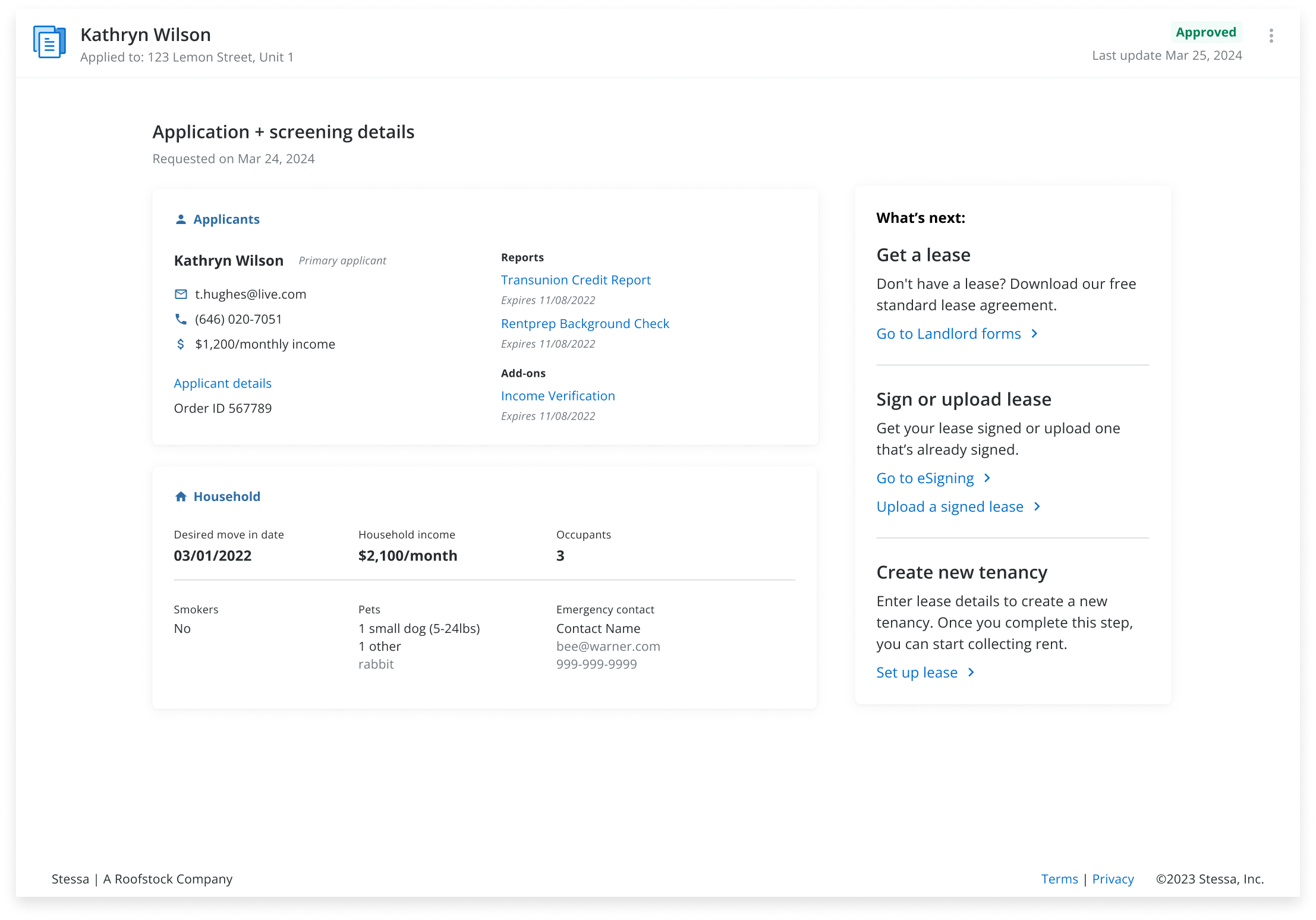
The applicant details page was adapted from an existing rental applications screen designed by another team. I refreshed the visual design to align with the screening context while maintaining consistency with the broader Stessa product.
Outcome
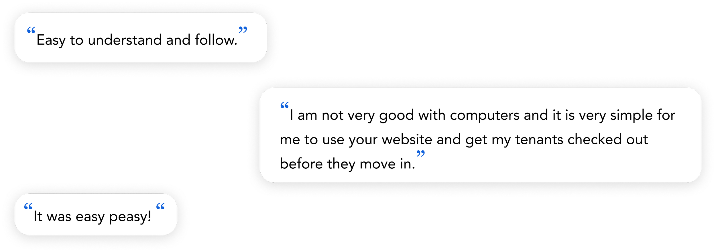
Landlords no longer had to piece together information from separate tools, and the feedback we got back reflected that, and people found the results view easy to read and the initiation flow much more manageable than what they'd used before.
$4M annual revenue: the native integration turned a third-party acquisition into a revenue-generating product line, establishing screening as a meaningful part of Stessa's business
85-95 NPS score: Landlords cited the clarity of the results view and the simplified initiation flow as meaningful improvements over previous workflows
Faster screening turnaround: Consolidating the workflow into Stessa reduced the time landlords spent managing screening across multiple tools.
Shipped end-to-end:The feature launched with full coverage across the initiation, applicant-facing, and results flows.
Reflection
This project taught me a lot about designing under real constraints. Without access to user interviews or funnel data at the time of the acquisition, I leaned heavily on competitive research and product intuition, which got us to a solid v1.
If I were to revisit this today, I'd push the dashboard from a status overview to something more directive. A landlord managing multiple properties and applicants simultaneously doesn't need a page that just informs them - they need one that guides them.
This is where AI could do meaningful work. Rather than showing all applicants in a flat list, the dashboard could use AI to intelligently surface what needs attention most urgently: a screening that's been pending for 48 hours, an applicant whose report just came back, a payment that's about to process. The key design challenge would be building landlord trust in those prioritizations: showing enough reasoning behind why something is flagged as urgent so the landlord feels in control, not overridden.