NexTransit
a solution designed to simplify the transit riding experience
ROLES
UX Researcher
UX Designer
Visual Designer
TOOLS
Google Forms
Figma
Invision
DELIVERABLES
User Personas
Competitive Analysis
User stories and flows
Wireframe
Prototype
Overview
THE PROBLEM
Due to the expansion of bus lines in the city, multiple bus lines
can now arrive at one same stop, causing confusion for transit riders.
Riders are no longer able to assume that they’d be getting on the next
arriving bus when standing at their bus stop.
THE SOLUTION
NexTransit is a mobile app designed to provide transit riders:
arrival times for buses for their selected bus stop
real-time tracking on where the bus is
real-time updates on alerts/delays
Research and Discovery
USER SURVEYS
I wanted to further understand the frustrations and behaviors behind potential users of the app.
Some of the questions I wanted to answer were:
How often did the participants take the transit?
What were their biggest frustrations regarding taking the transit?
What were their favorite features in existing transit apps that they used?
After surveying 21 participants, I found out that:

62%
take the bus on a daily or weekly basis
72%
have used a mobile transit app
72%
have experienced receiving inaccurate data on transit apps
I chose 3 survey participants to further interview to get a better sense of the main pain points for transit riders and areas of opportunity for an emerging transit app.
100% of interviewees mentioned wanting to be able to see live-tracking of where the bus is on the map.
66% mentioned inaccurate data on schedules and delays being their biggest frustrations with current transit apps.
“There have been many times where I only find out about delays once I am physically already at the bus stop. I wish the information about delays/status updates on apps could be more accurate so that I don’t end up leaving my house to the bus stop too early or too late.” - Interview participant
COMPETITIVE ANALYSIS
65% of the survey respondents used Google Maps to retrieve transit information, and 23% used Transit. With these two apps coming in as the top 2 most used apps, I wanted to learn more about what my NexTransit would be competing with.
dominates most of the market
offers directions with transit, driving, trains, and walking
real time transit updates and information can be inaccurate at times
includes real time updates of transit schedules, delays, etc
ability to save locations and lines to favorites
UI is a little overwhelming, tons of varying font sizes all over
Information Architecture
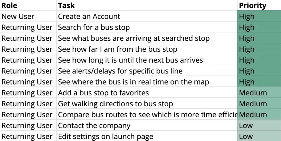
USER STORIES
Using the information from the user surveys and interviews, I put together high, medium, and low priority user stories.
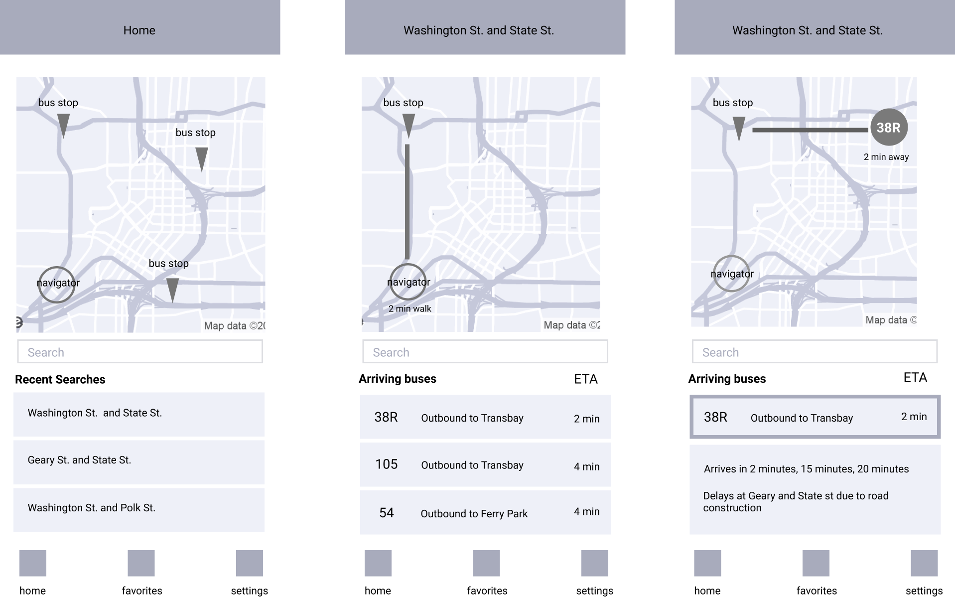
WIREFRAMES
I began to create wireframes based off of the high and medium priority tasks that users would want to accomplish. While putting together these wireframes, I wanted to keep in mind to design an app that doesn’t have an overwhelming amount of information, and is easy on the eyes for the user.
Visual Design
1ST ITERATION
When fleshing out the details of adding colors and choosing a font, I chose green because the color resembles trust, safety, and resembles environmental-friendliness, which people associate with public transportation.
USABILITY TESTING
I conducted usability testing amongst 5 participants and asked them to perform simple tasks such as logging in, accessing their recent searches, looking up the next arriving bus for a specific bus line, and searching for a stop.
100% of participants were able to complete all tasks. Some of the feedback that I received included:
“The icons for the bus stops don’t quite fit in with the rest of the interface.”
“Overall, the app Is intuitive and simple to use.”
“I like that there isn’t an overuse of green, and the color is used where the information is important.”
“The green in the app could be a little more sharp, it doesn’t strike as a memorable color.”
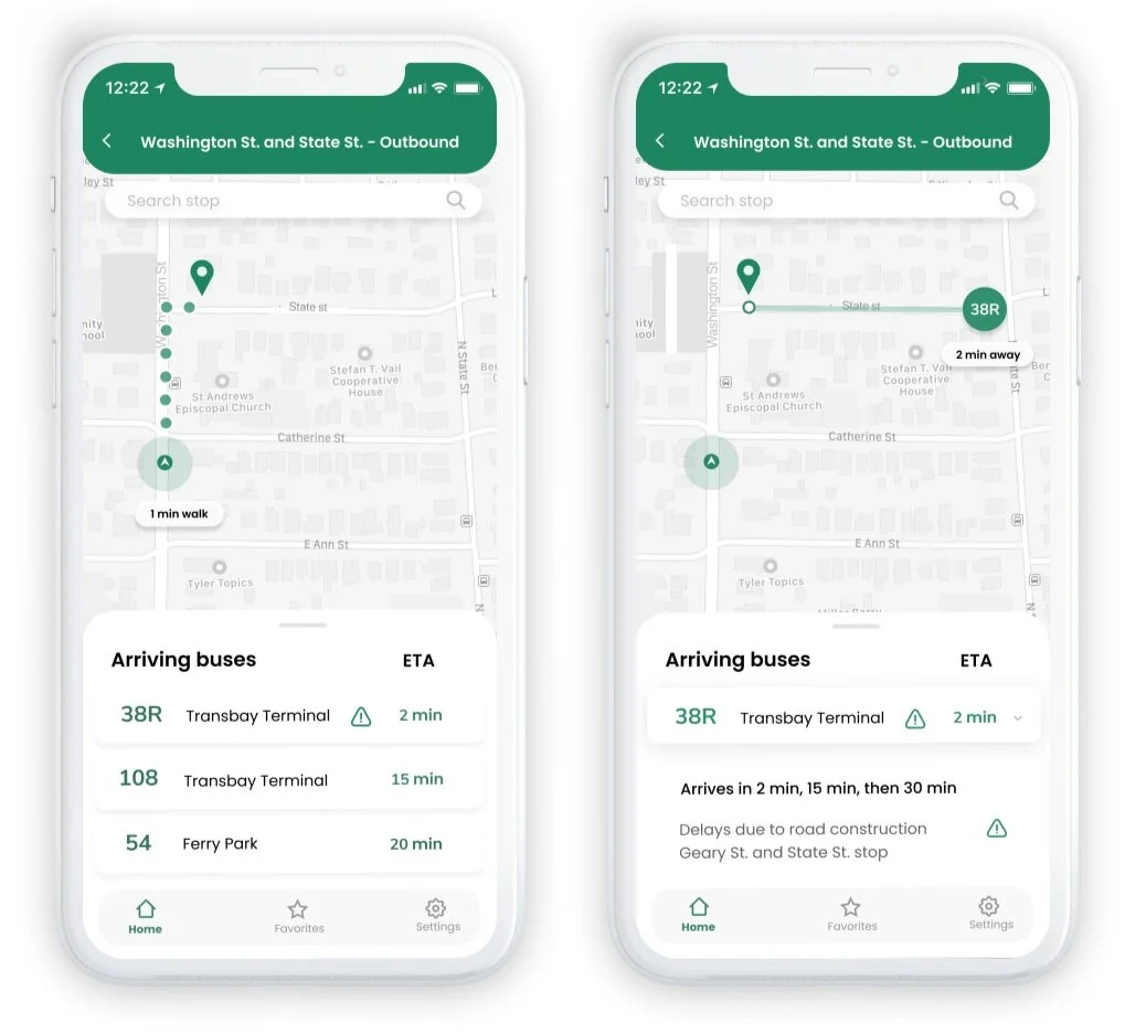
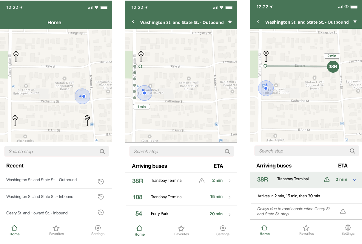
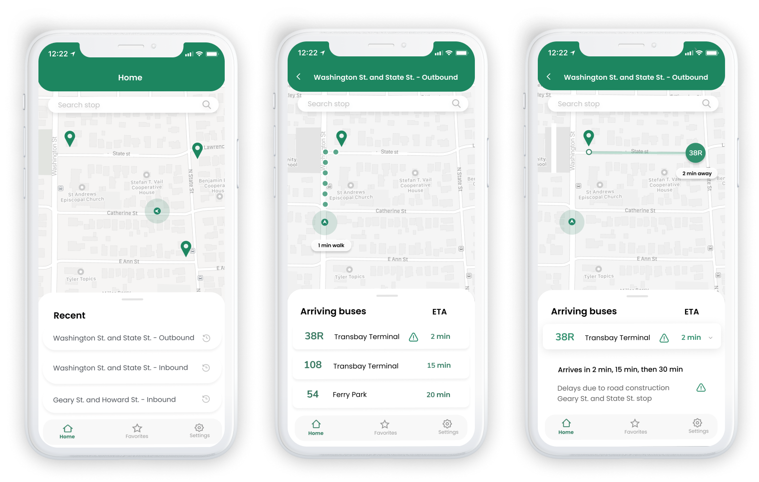
FINAL PROTOTYPE
For my next iteration, I decided to give the app a more modern, clean, and enjoyable design by:
rounding all the cornered edges to make it more welcoming and friendly
changing the font to a friendlier, rounder one
changing the main color to a sharper, more memorable green
removed borders around buttons and made them “pop” subtly to increase white space
moving the search bar to the top of the screen to comply with iOS Human Interface Guidelines
changing the bus stop icon so that it would match the rest of the interface
Conclusion
OUTCOMES
The final prototype displays a simple and intuitive way for users to retrieve information on their next arriving bus at their selected bus stop.
Riders now have real-time tracking of where the bus is located in respect to them, as well as accurate and updated alerts per bus line.
They are also able to see how much time they have to make it to their bus, with the added walking directions and time estimate.
Given more time, I would definitely do further user research into a wider demographic of people, and conduct another round of user testing on the final prototype, to make sure that the previous problems that were brought up in the initial round of testing were solved.