

COOP Careers
Student Dashboard
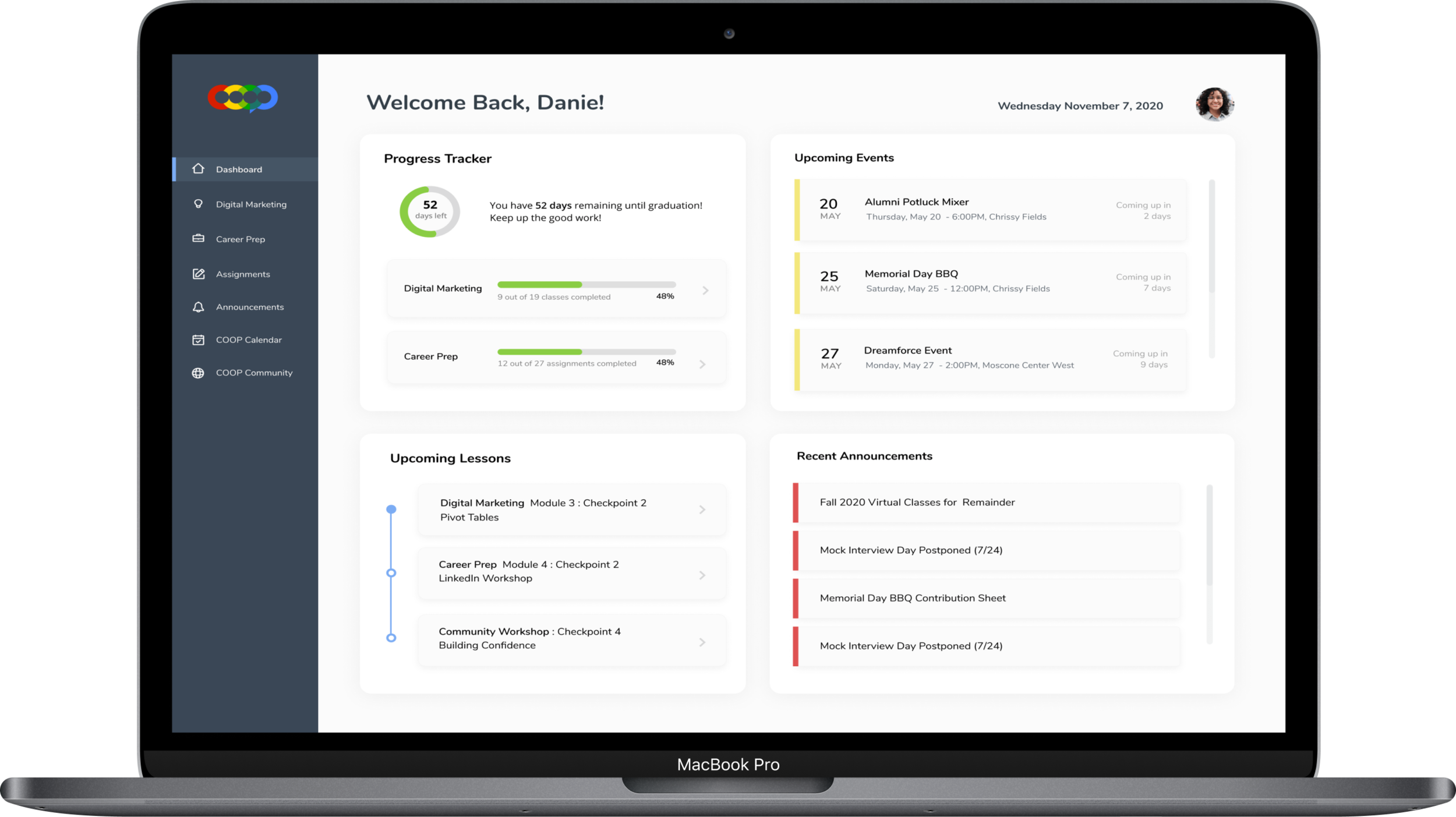
Designed to streamline the program experience for students in COOP Careers, allowing them to access study materials, track assignment and program progress, and stay up to date with upcoming events and announcements.

ROLES
UX Researcher
UX Designer
Visual Designer
TOOLS
Figma
Google Forms
Invision
Whimsical
Usability Hub
Zoom
DELIVERABLES
User surveys
User Personas
User stories and flows
Wireframes
Prototypes
Overview
COOP Careers is a nonprofit organization that helps low income college graduates overcome underemployment through gaining digital skills and peer connections. Students gain knowledge in a variety of skills including career preparation through workshops, a digital marketing or data science specialization through classes, and community building.
As an alumni of this program since 2017, I can proudly say that I’ve met some awesome people here that I still consider my great friends to this day!
Visit their website at www.COOPcareers.org
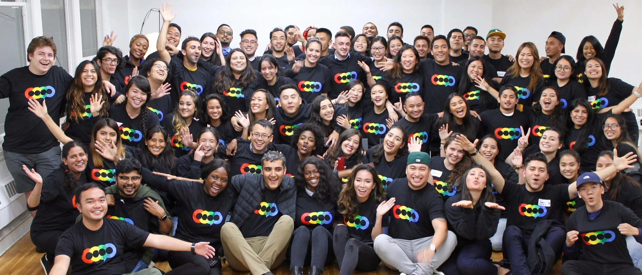
Photo of a COOP bay area cohort. All smiles!
THE PROBLEM
No streamlined way to navigate the program
There isn’t a streamlined and organized way for students to keep track of their progress, assignments, attendance, announcements, and upcoming events.
Students currently access their study materials and submit assignments through Google Classroom, receive class and event updates through Gmail, and check for new announcements through Slack.
Imagine having to keep a tab open for each of these applications while balancing a bootcamp: sounds tedious, right?
THE SOLUTION
Creating a student portal/dashboard that ties everything together
Simply put, I designed an internal dashboard that allows students to:
submit assignments and track progress on classes completed
view recent announcements and upcoming events
access class materials and submit assignments
access a COOP calendar
Research and Discovery
USER SURVEYS
I wanted to gain a better grasp of what struggles current COOP students faced with the program, so I crafted together a survey to send out to 20 students. Some of the questions I wanted to answer were:
What areas of the COOP Careers program can use improvement in to make the overall experience less tedious?
What data and features would a student find useful in a dashboard?
What type of KPI would a student find valuable to track for themselves?
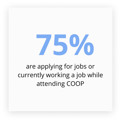
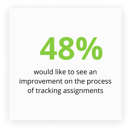
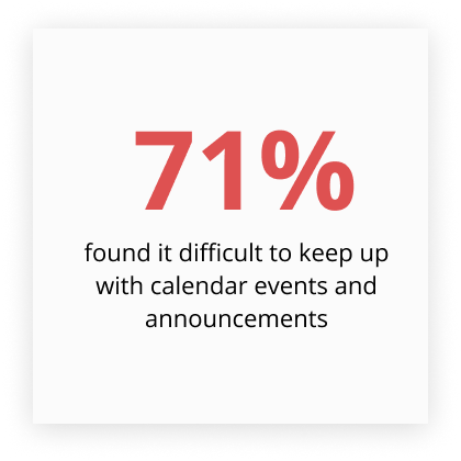
Key findings from research included:
USER INTERVIEWS
After interviewing one mentor and three students, I was able to confirm that the biggest pain points that students were facing were keeping track of all the different announcements and events, and viewing all the class materials/assignments in an organized manner.
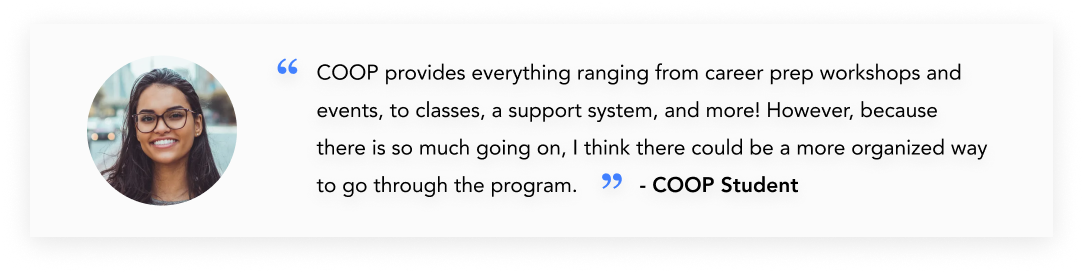
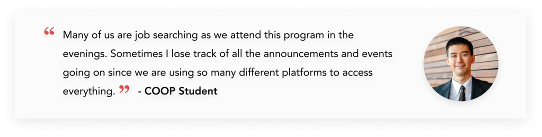
With this information, I wanted to keep in mind to prioritize designing an easy to use, intuitive, and organized UI for the student. Students valued being able to track their progress and staying updated on upcoming events. Since this program has many focuses (hard skills, career prep, community), I wanted to design to reduce the cognitive load.
USER PERSONAS
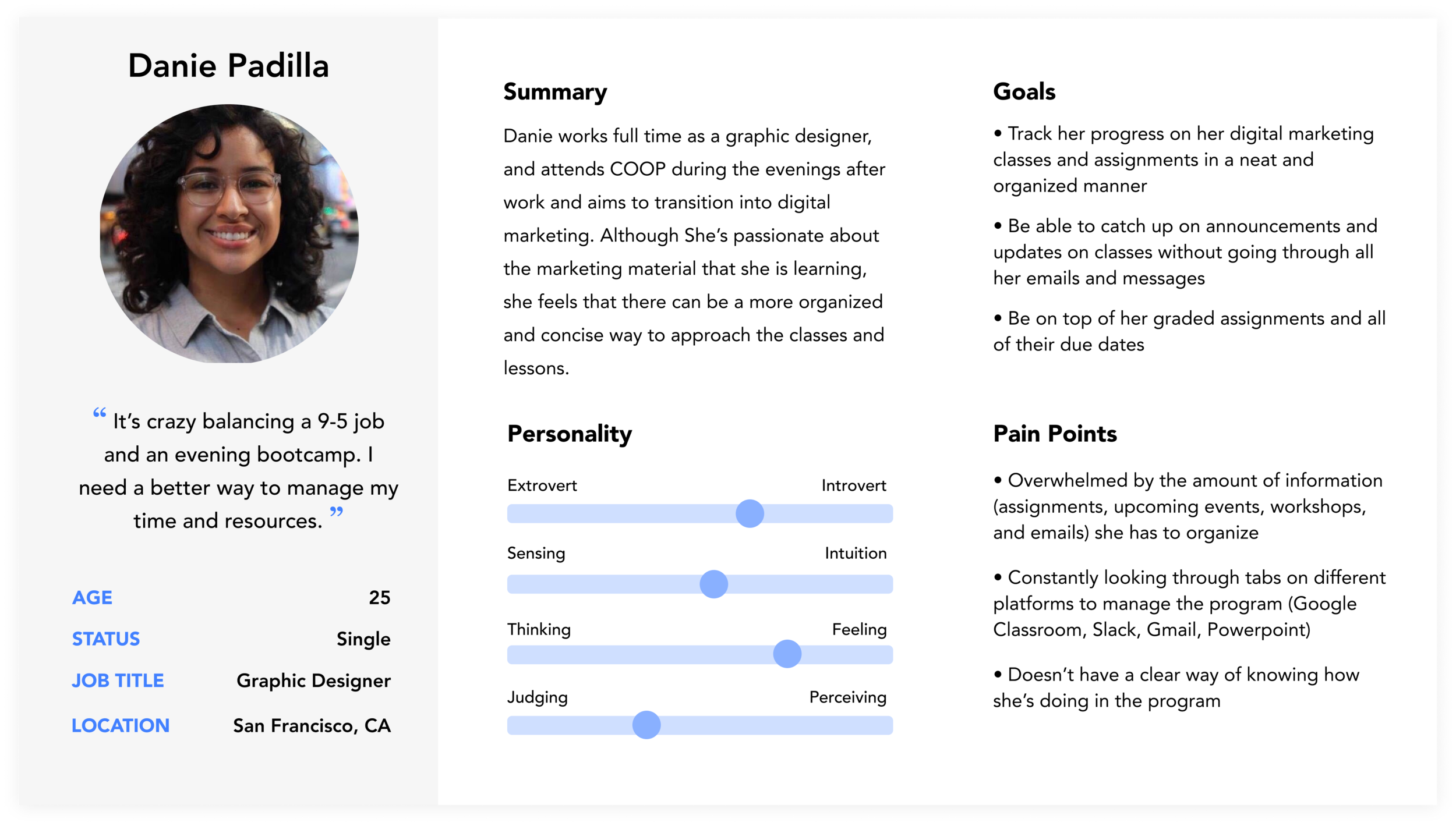
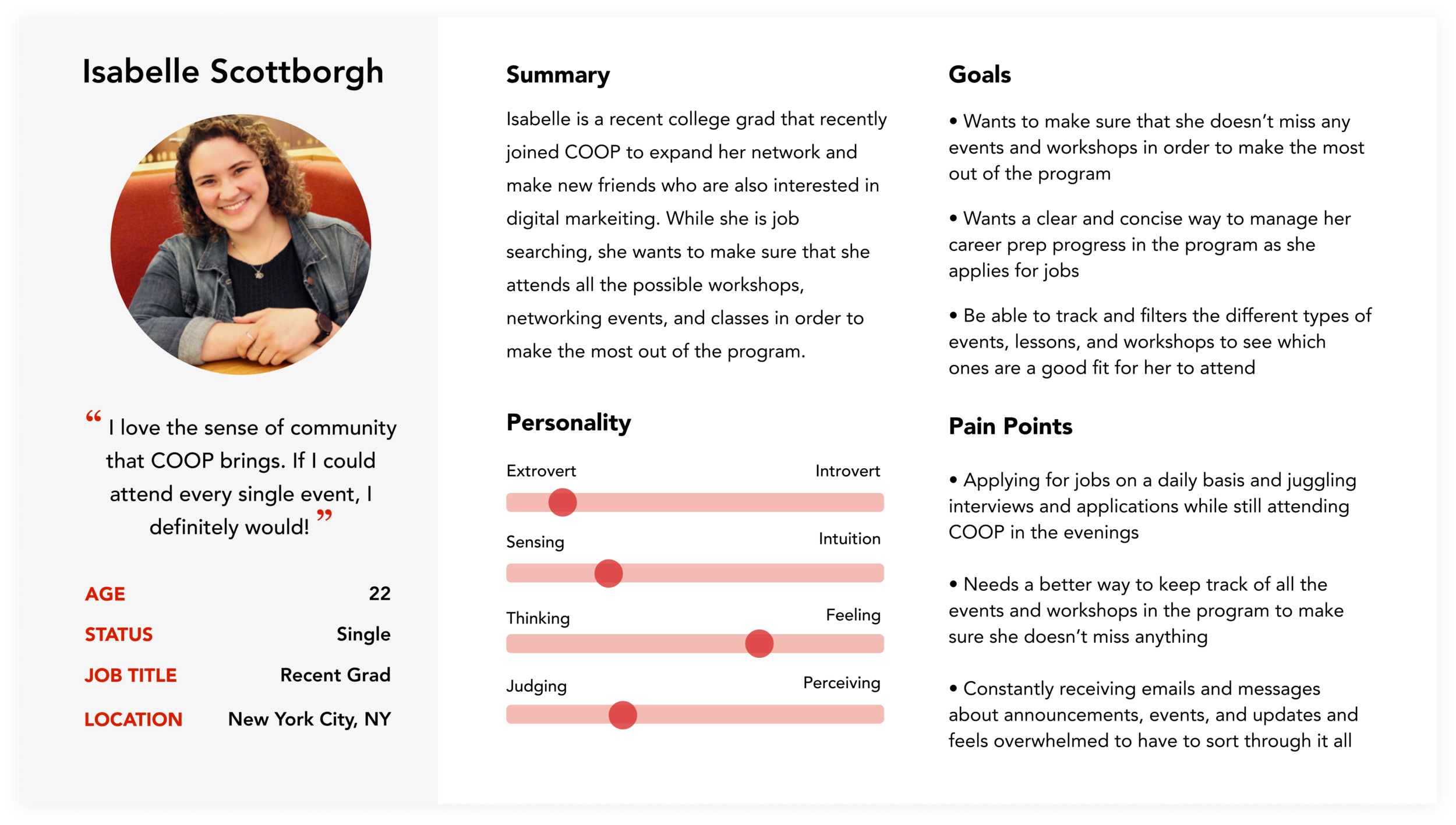
With my findings from my user research, I crafted together two user personas, Danie and Isabelle. Each resemble a student currently in the program that have different goals and face different pain points pertaining to their situation.
Information Architecture
USER STORIES
Using the information yielded from the user surveys and interviews, I created user stories using the goals that Danie and Isabelle would like to achieve through COOP, and divided them by high priority and low priority.
USER FLOWS
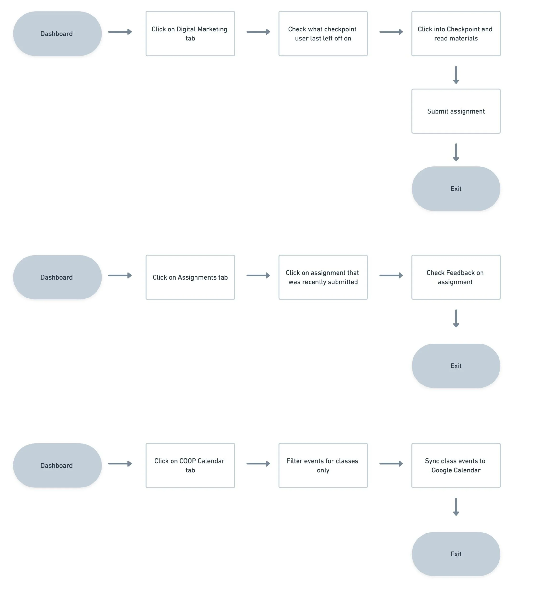
The high priority user stories were then created into user flows on Whimsical to show the process of how the user would accomplish each task.
EARLY EXPLORATIONS
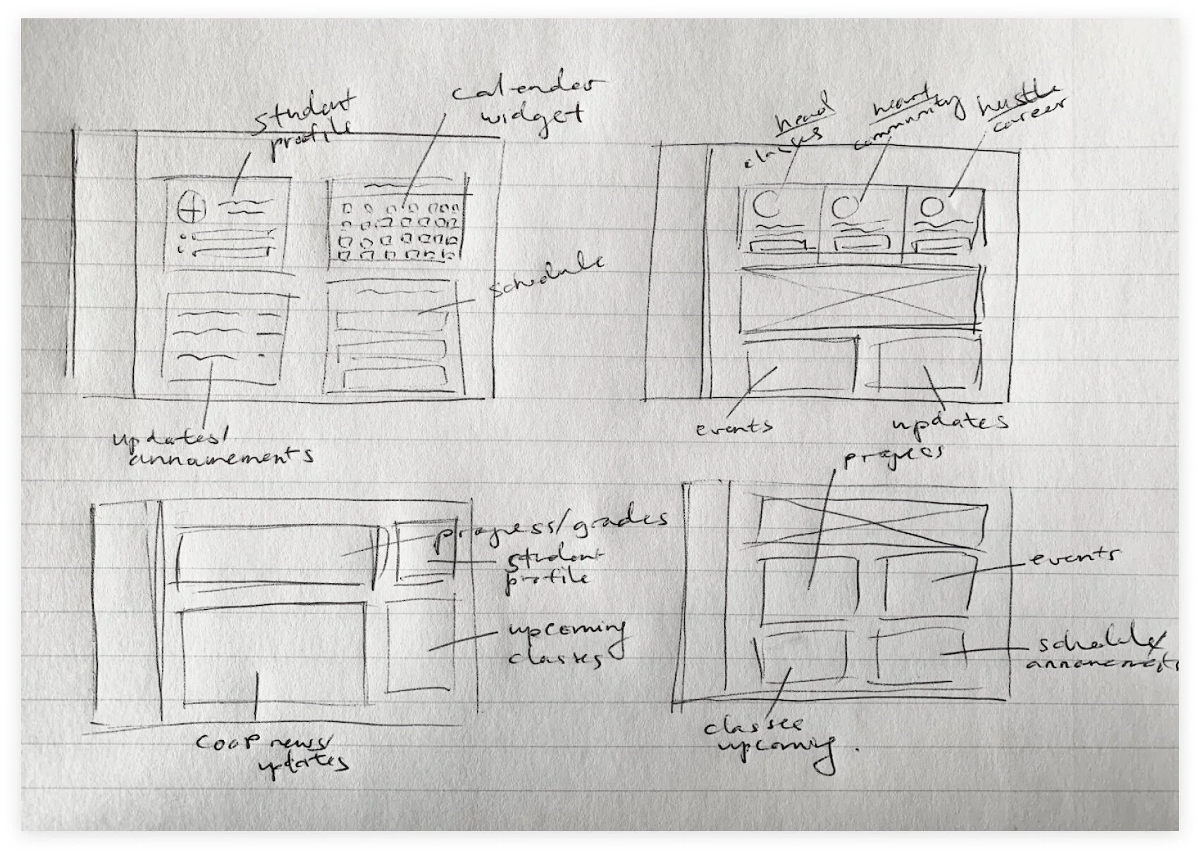
Using the user flows and user stories, I began to sketch design ideas and explorations of a possible dashboards for COOP students.
WIREFRAMES
Using the high and medium priority user stories along with the user flows, I began to create lo-fi wireframes using difference components taken from my sketches.
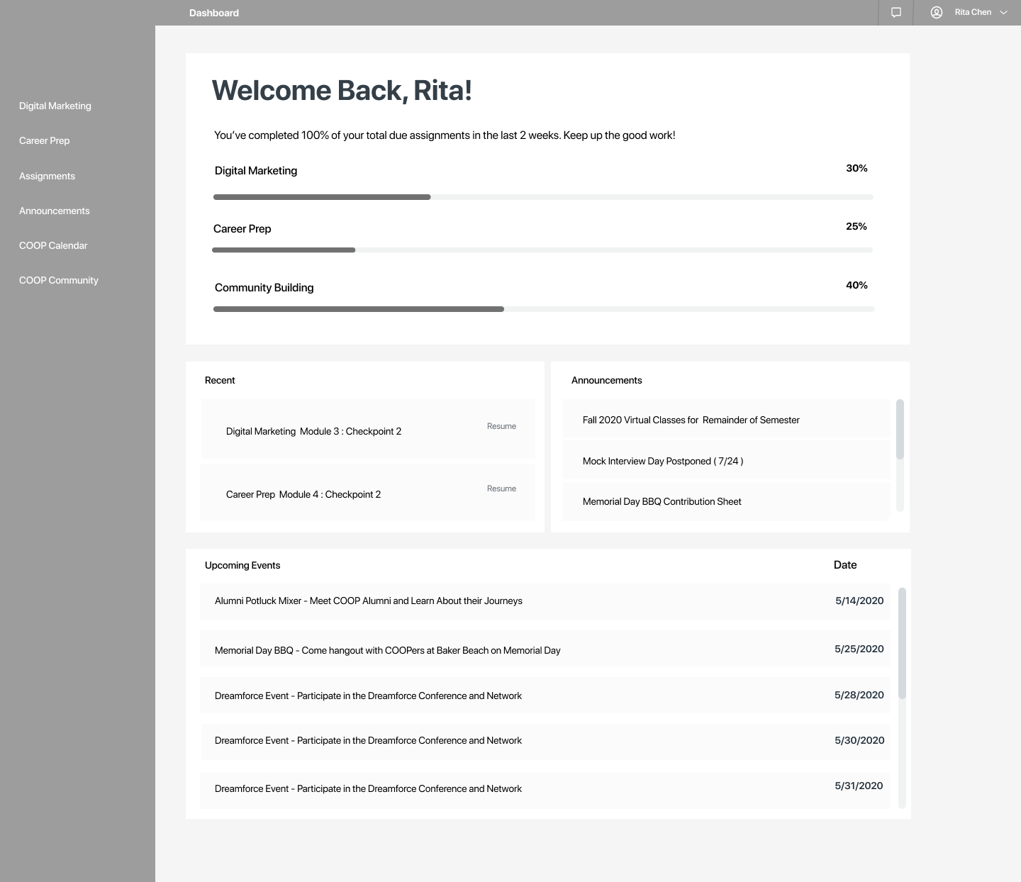
Home page dashboard
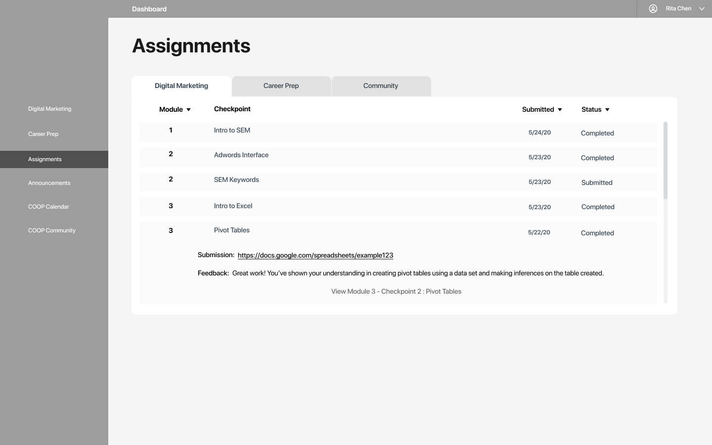
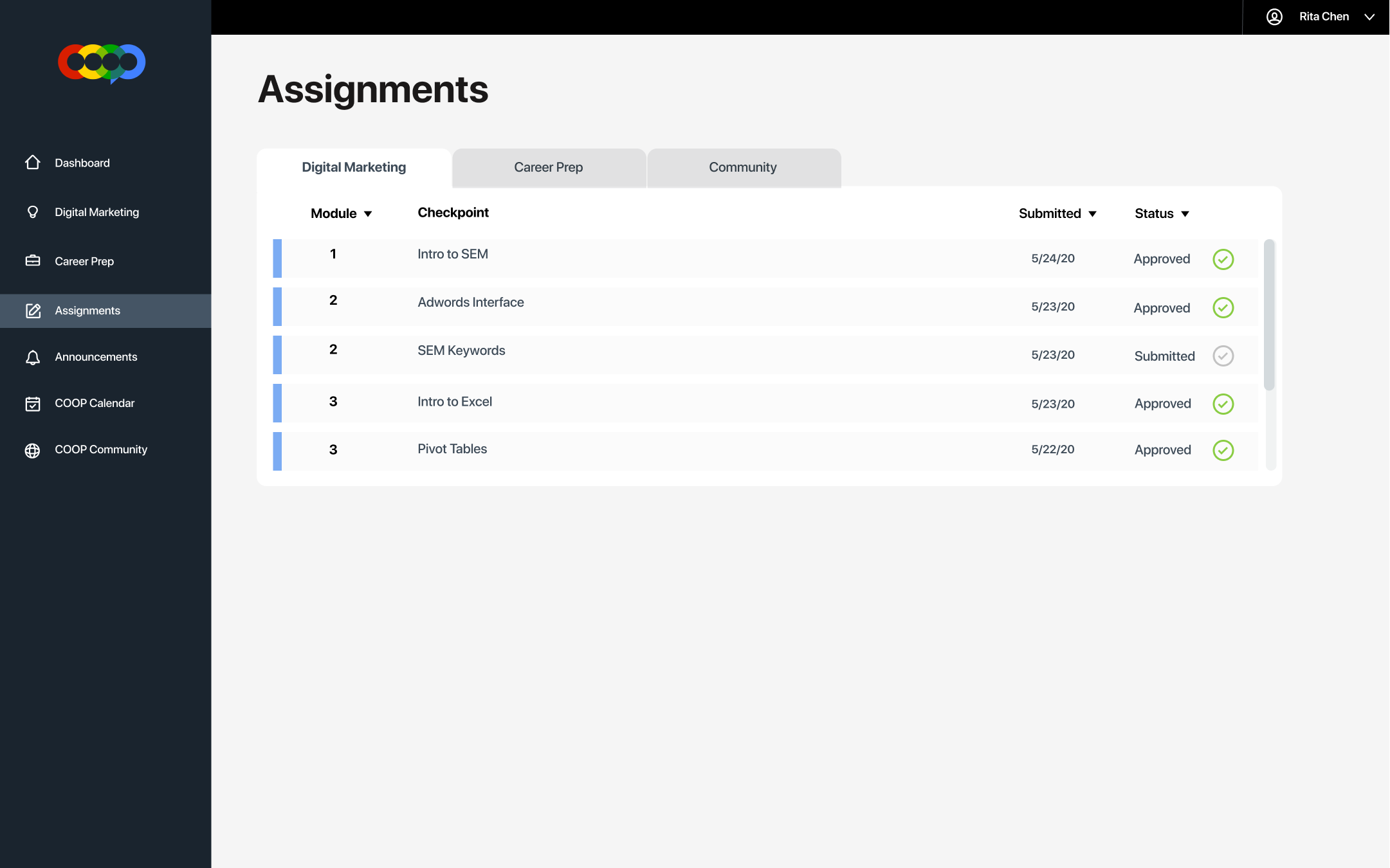
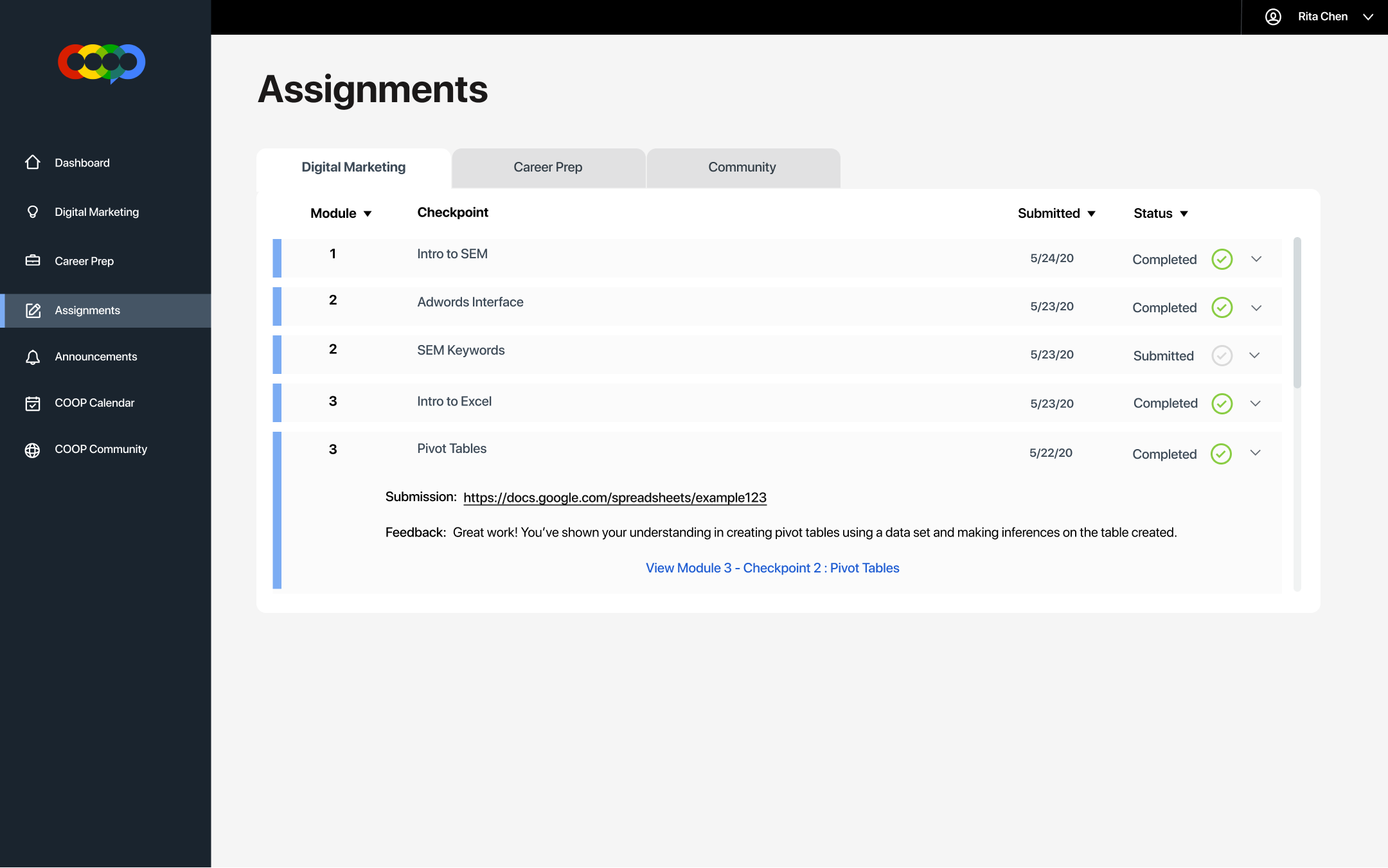
View submitted assignments
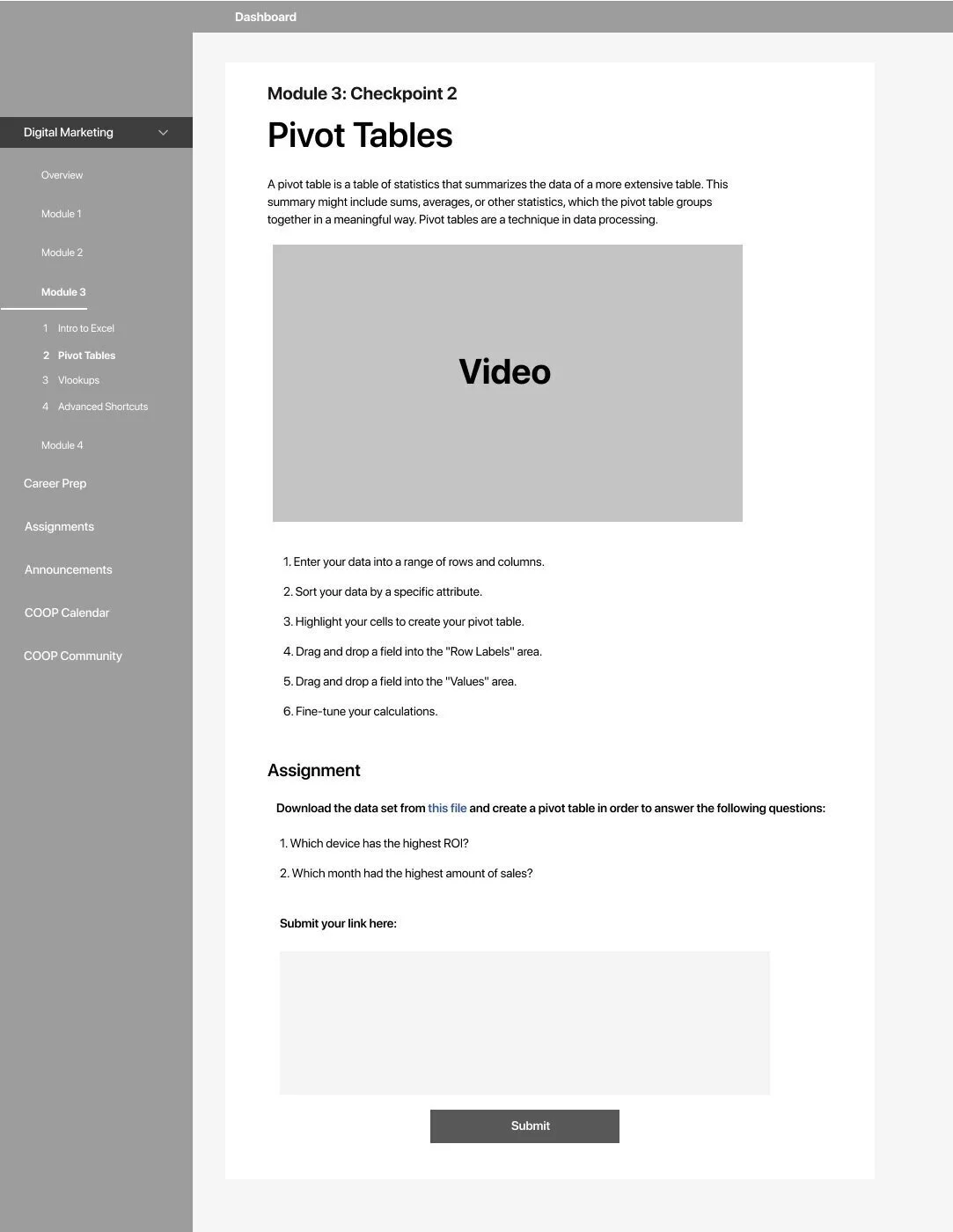
Viewing a module/checkpoint with the assignment submission box on the bottom
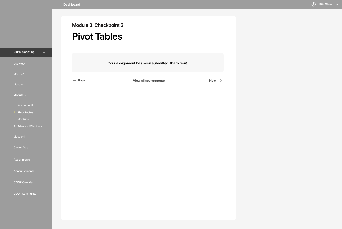
Assignment submission confirmation screen
USABILITY TESTING
To get a better sense of the ease and feel of the website, I conducted usability tests with mentors and students from the program. I had them complete simple tasks such as submitting an assignment, checking for upcoming events, checking feedback for an assignment, etc.
Some useful insights that I found out in my initial round user testing were:
The dashboard “button” didn’t seem clickable, it might be redundant to have it there
The progress bars in the main dashboard were confusing. What does the percentage measure?
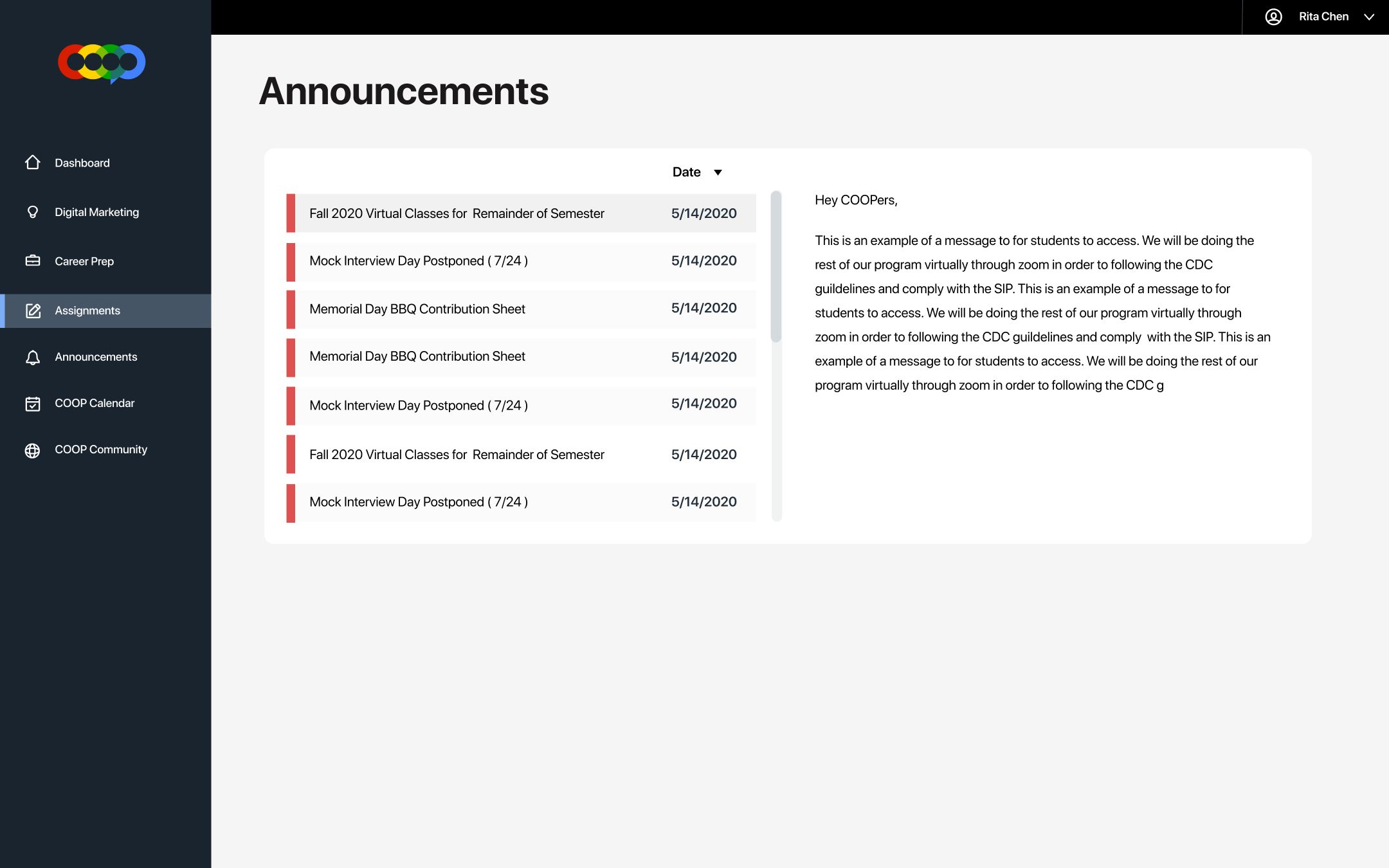
Announcements info on the main dashboard should pop up in the same screen instead of redirecting to a new page
The card on the main dashboard that says “Recent” is confusing, what exactly does it resemble?
Visual Design
1ST ITERATION
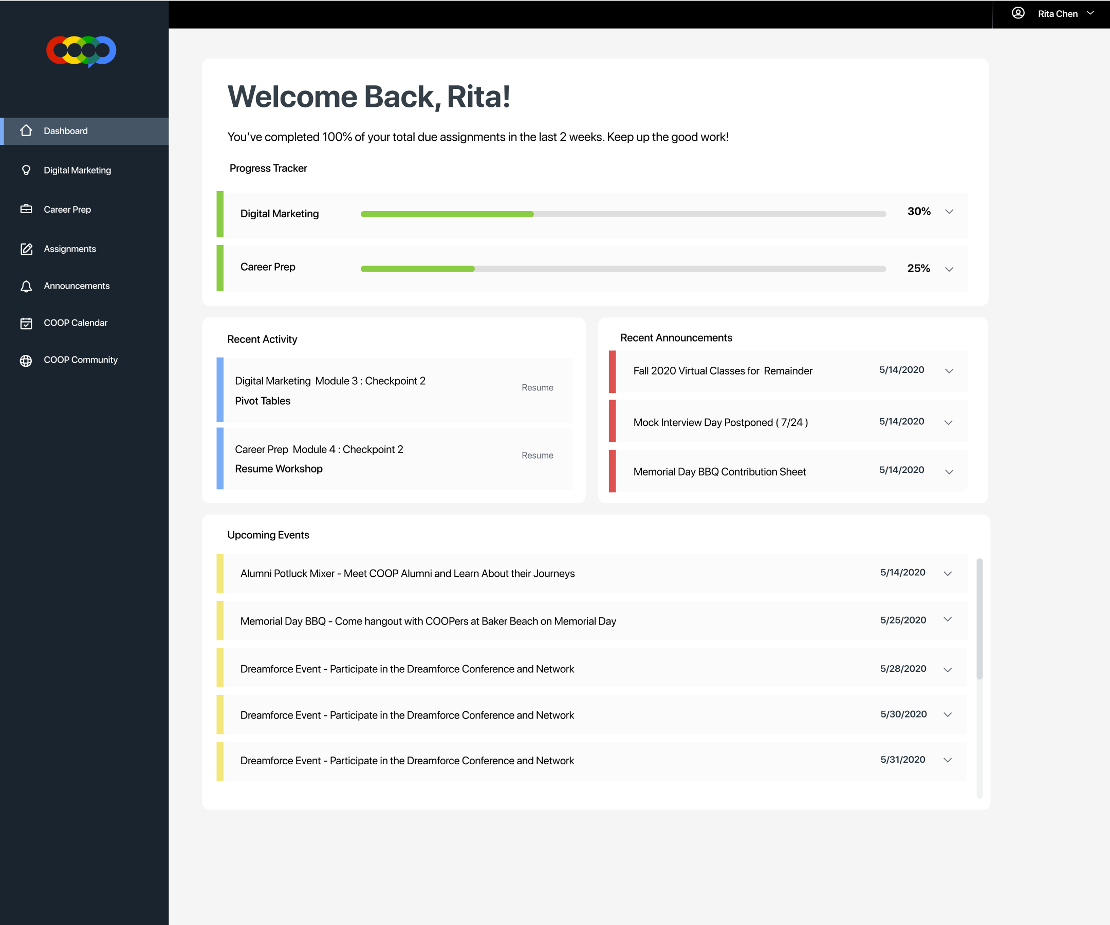
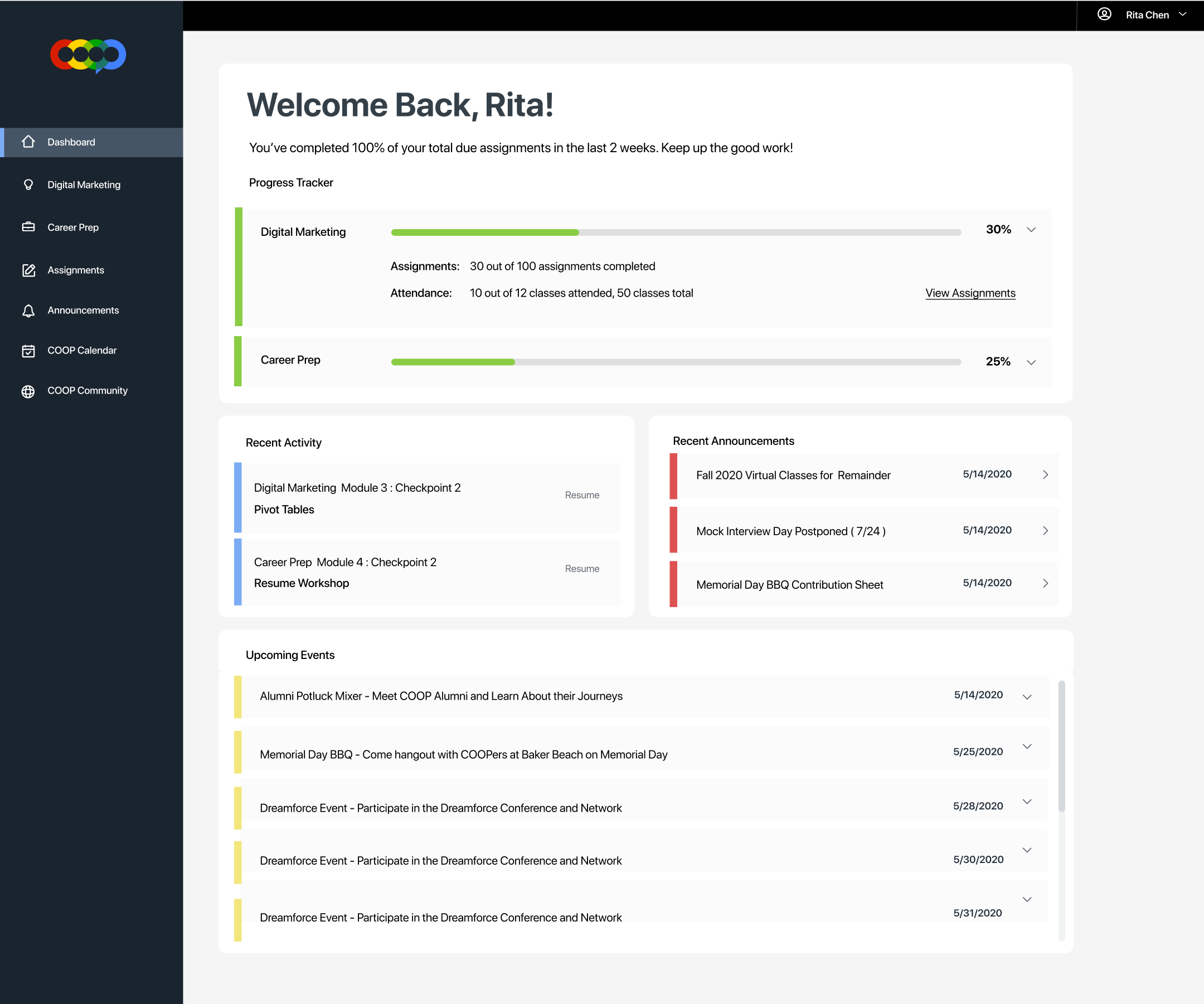
Using my wireframes, I incorporated the brand colors into the dashboard while maintaining enough white space in the interface.
I used each brand color to separate the different aspects (progress, recent activity, announcements, upcoming events) of the program in the main dashboard and throughout the rest of the website as well. This creates an easy way for the user to separate and organize important information when they first log in.
FINAL PRODUCT
With my final iteration, I changed the task bar color to dark gray/slate instead of black so that it would be easier on the user’s eyes.
I also changed it so that dashboard information would pop up in a new box when a user clicked on a button or “card”, instead of having open in a dropdown. I did this to simplify the dashboard so that the user can focus on things one at a time when clicking into the cards were clicked on. In the first iteration, having the information “drop down” took up too much space, felt crowded, and limited the amount of information I could squeeze in.
Dashboard Home Page
Open Recent Announcement
Open Event Details
Flow: Read Module/Submitting an Assignment
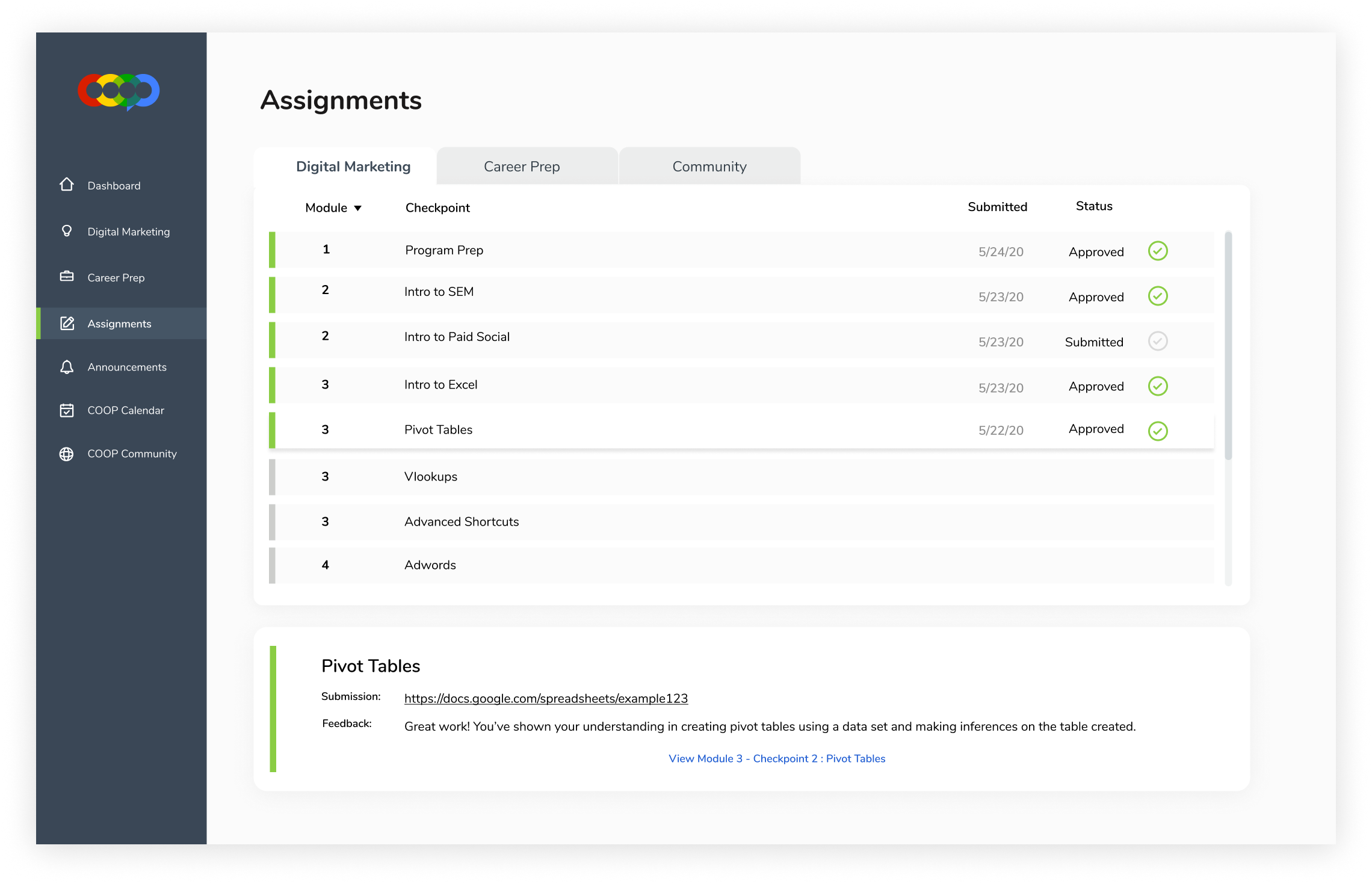
Flow: Viewing all assignments and checking for feedback
Unsubmitted assignments are now grayed out so that the green color communicates completed assignments.
Retrospect
RESULTS
Students would now have a more seamless and organized process to streamline their COOP program experience. Retrieving information on class materials, submitting an assignment, and finding out about recent announcements and events are now all available at the convenience of a click! 100% of students who were interviewed to use this product felt that it was useful and enjoyed using it.
After showing this project to the founder of the company, he was impressed and invited me to work on redesigning the company website. Currently I’m working with the Director of Development and a program manager at COOP Careers in planning and executing a redesign for the company website. Stay tuned!
TAKEAWAYS
I learned the importance of interviewing the right target audience. I had interviewed and surveyed current students, alumni, and mentors. Although mentors and alumni also know the program inside and out, I found that a lot of key insights were most valuable when taken from interviews with current students. Being an alumni of the program myself, I enjoyed being able to empathize with the students as I interviewed them since I also remembered how tedious some parts of the program could be.